Imaginative pieces may stem entirely from the creative visions of the mind, but to render a convincing/realistic drawing requires good familiarity with the forms being depicted. For example, to draw imaginary people requires an understanding of skeletal and muscular forms if something convincing is to come from no reference.
When possible a source of reference can be of great value, whether adhered to rigidly or as a loose template to help the mind solidify the thing it is trying to create.
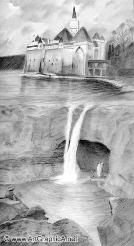
In this drawing online lesson, two photo references are used fairly extensively, merging one into the other to create a two-tiered cascading effect in a make-belief realm of fantasy.
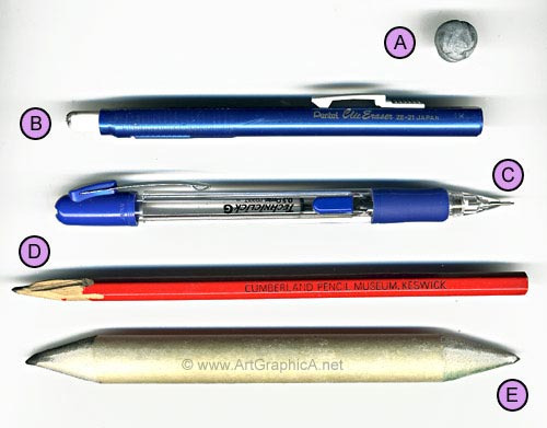
Art Materials
A - Putty Eraser
B - Pen Eraser - a retractable/extendable cylindrical rubber, encased in a plastic pen like holder
C - Mechanical Pencil, 0.5mm, with HB graphite refills
D - Conventional 2B pencil
E - Large Blending Stump
The mechanical pencil and pen eraser were bought from a stationary shop; the blending stump and putty eraser fragment (already well used by this stage), came from a small art supply shop.
The paper used was an A3 sized piece of heavy-weight Bristol Board, which is smooth and with virtually no detectable grain.
Photo References
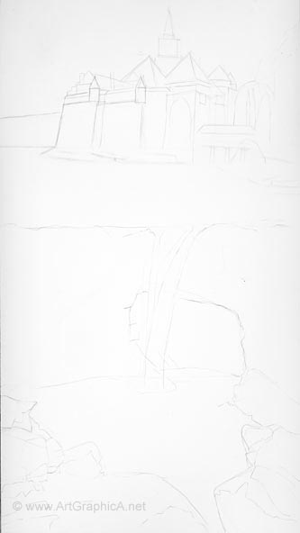
Outline
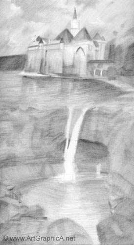
As with all previous examples, I begin with an outline – important in this case as the composition will fill the whole of the drawing area, and in my own mind I need to have a concept of where the elements will lie and relate to one another. The main composition is essentially laid out in thirds with the castle/water occupying the top, the rock face/waterfall in the middle ground and the boulders/water in the bottom third.
The photograph (right) was included (the darkness of the lines are exagerrated a little) as the initially oulining is fairly light and does not show so well on video.
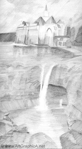
Block In
My initial thinking on how to embark on this piece, was first, to keep a slightly loose almost sketchy feel, where any focal points can be rendered with a little more detail and sharper edges towards the end of the drawing. Secondly I was eager to kill the white of the paper and start blocking in some tones as quickly as possible.
In this initial stage, the 2B pencil is used at a low angle of tilt, and all areas (bar the waterfall) are roughed into place with some rapid back and forth motions of the pencil – quite the opposite of the ‘graphite landscape-light and drama’ demonstration which required much tighter, shading/hatching and more time consuming as a consequence.
At this stage it is not important to hit all the desired values, and in many respects it is beneficial to build up the contrasts in two or three layers. To go too dark too soon can make it harder to blend the graphite, and more so given the crudeness of the initial block in.
Blending
A large blending stump is used throughout the drawing, its size and weight make it convenient to cover larger areas and apply more pressure when required. The paper is heavy-weight and with virtually no grain and so smoothing out the roughness of the previous block in, is quite straight forward. For the most part, blending follows the same direction as the pencil strokes. For the sky and vegetation, the strokes mainly lie in a single direction, contributing to the looser feel; the water is more horizontal, though with a curvature as it comes to land. The direction and form of the rock face is slightly more variable - if you can mentally run your hand over the surface, it helps fix in your mind the texture, form and direction of contours.
Block In / Blending II
After the first set of blending, what results is something like an underexposed photograph – imagine the early stages of an instant kodac photo as it begins to expose when in contact with air. The processes of the first block in/blending are repeated in exactly the same fashion. At this current stage all edges are blended soft, I am just interested in values placed more or less in their right position. Creating too many hard edges is a common mistake, and so by working in this slightly blurry to refined manner if is more likely that their will not be an abundance of sharp edges.
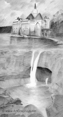
Refinements
With the values more or less approximating their finished state, and all edges softened to various degrees, it is then necessary to add details and sharpen some edges to draw the eye. The mechanical pencil is used for these refinements, and I rest my hand on a piece of kitchen paper so as not to pick up graphite and redistribute it elsewhere.
Some of the more obvious sharper details are areas like the small cutaway window recesses, but for the most part, edges are a matter of personal choice and preference. I add a slightly crisper edge to some of the turrets, but leave a few others as they are as a subtle attempt to make them slightly less similar and bland. In another effort to add a little interest, the whole castle area tilts subtly and the bottom castle walls bend outward. Although a putty eraser works best for most jobs, I sometimes use my pen eraser, cut with a craft knife to form a sharp chiselled edge.
Vegetation
The foliage to the right of the castle is an area I wanted to keep loose, and with a similar stylised directional shading to match the sky. There’s no real detail here, just form, with the exception of some protruding tree branches, again kept fairly loose. Working rapidly helps maintain the looseness and prevents the brain from trying to over analyse.
Water / Waterfall and Boat
I tend to conceptualise and simplify water; you could follow your source very closely, but it will take a lot of time. The reflections come down vertically towards the viewer and the reflections are generally darker than the object they represent - be it sky, tree or castle. You can draw your water using the principles of negative space, drawing around areas of highlight, or if it is more convinient, use a putty or pen eraser to mark in lighter areas.
The shading in the waterfall is relatively subtle and soft, and so I use the graphite that has already accumulated on the tip of the blending stump and use this to add just a little bit of tone.
The boat is just a ploy to add interest to the cave, and to give the impression that there is something back there to explore. An eraser was used earlier to keep a lighted area against the darkness of the cave. This is then refined a little with the pencil; a couple of suggestions of figures are added to the boat, and the putty eraser is applied to the water to create the suggestion of a reflection.
Finishing
The rock face is a door way to the past, built upon many compacted layers of sediment, which can be reflected with fairly angular horizontal and vertical suggestions that lend a little focus to the toned area. If these suggestions become too sharp and stand out a little too much, a quick wipe of the blending tool should take the edge off them.
The water at the base of the waterfall is rendered in the same way as that at the top, though a little lighter and with more curvature whilst it sits encapsulated by the surrounding rocks.
To unify the two photographs and create a barrier for the water, afterwards I added a small protruding rock to the top left of the rock face.