Concentrating and working on the same drawing for an intensive period of time is a sure fire way of killing objectivity, and the simplest of mistakes are not always apparent. So how do we spot such errors, what are the pre-emptive measures and how can we fix those that go wrong?
Pre-Emptive
 Burne-Jones
Even with pre-emptive measures, it is rare for things not to go wrong, although if you are tracing or using grids there is far less opportunity for mistakes, but on the same hand, reliance on such measures is not so conducive in learning how to draw.
Planning is the best pre-emptive approach; take the time to mentally study your source of reference for some time, and draw it in your head. Envision the structure and order in which you wish to draw the scene, decide upon composition and focal points, and look for any patterns that will aid you. If you are about to embark upon a particularly refined piece that you know will consume many hours, an initial sketch will better acquaint you with the piece, and also highlight any problematic areas. Some of the old masters produced preliminary sketches that could hold up as works of art in their own right.
Pre-Emptive
 Michaelangelo
 Van Gogh
Periodic breaks, or simply stepping back from your drawing to view it from a distance or a different angle works remarkably well. It is all too easy to keep a face to a page and focus on small details, losing sight of the drawing as a whole. It also pays to have worked out any compositional elements, particularly if a background or multiple objects are to be included. Failure to do so can result in the artist trying to force elements of the drawing into too tight, or overabundant a space so that they do not really sit comfortably.
The favourite and most effective (in my humble opinion), of all tricks, is the mirror. It lends fresh, objective eyes to the subject and usually, and sometimes alarmingly, highlights perspective issues and incorrect curvatures – particularly useful in portraiture, accentuating places where symmetry may have gone astray.
Where Things go Wrong
Recognising mistakes after the fact is important, even when there is little chance of putting them right. Most problems lie in the initial outlining of the composition, the human face being notably demanding as the slightest deviations can dramatically alter an appearance.
 Burne-Jones
When perspective goes wrong, drawings can appear odd, and this oddness can be a challenge to pin down. Checking lines (with a ruler if need be), and ensuring they obey the basic rules of perspective should be enough to spot problems with straight edged architectural elements (i.e. ensuring they converge towards a vanishing point, even if this point is a long way outside of the borders of your page). Perspective and people, especially where foreshortening has been made, is tricky and a mirror might again be the best tool.
Incorrect tonal values are a common problem, beginners in particularly are afraid to go dark, or swing to the other extreme and make everything too dark. There is no reason why your values have to match your scene, but to capture the essence of what is seen, the values should at least be relative to one another. As an example, take the human eye. It is a common mistake not to shade the whites of the eye, where in actual fact they usually possess a shadow cast by the upper lid, and in general, follow some of the shading properties of a spherical object. Although it may seem a little pedantic, I learnt in oil painting that the white dot that marks a highlight on the pupil, should not be produced with pure white paint, but instead should be slightly off-white. The reason it appears white is because it stands in stark contrast to the pupil.
In the advanced section we look at a dramatic cloud formation, and achieve a sense of light and value through some fairly subtle shading.
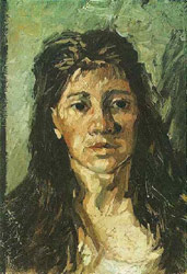 Van Gogh
Depth perspective can be destroyed by making distant elements the same value as objects in the foreground, although there are always exceptions; again in the cloud-scape drawing, the distant shore does remain the same contrast as the foreground, though generally speaking, elements appear lighter as they recede into the distance.
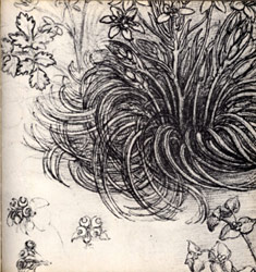
If form and direction are not adhered to, you will not be able to convincing depict hair or the movement of branches in a tree. Always take mental notes as to the three-dimensional qualities in your source (easier to do in life drawing as opposed to photographs); shading and contrast will define these shapes and if you are unable to visually conceptualise the objects three-dimensional form in your mind, you are liable to get it wrong on paper.
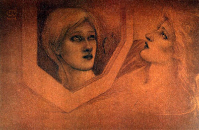
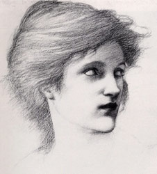
Be aware of the direction in which objects flow, like the folds in a gown, or the hairs on a head. You can replicate the dynamism by follow the motions, for example, with hair, draw it from root to tip following the curvature as you see it. The images by Pre-Raphaelite Burne-Jones, impressionist Van Gogh and Renaissance Master Da Vinci, show how each are paying close attention to direction and movement.
Correcting Mistakes
 Leonardo Da Vinci
Different mediums possess different techniques for correction. Graphite is straight forward – the eraser, both the hard conventional type for erasing heavy areas, and a putty which is effective at lightening and correcting tones. When sketching, mistakes can be covered up by drawing amended lines bolder and darker so as to detract the eye from the former incorrect placement (this concept is used in the watercolour portrait sketch). Initial lines are placed lightly, and subsequent darker refinement detract the eye from the initial guidelines that were drawn into place.
If a mistake occurs a long way into a drawing, you may have to come to the decision to either live with it, or make some major corrections and rework perhaps an hour or two’s labour. Occasionally the best solution is to put the drawing down to experience and start again.
Oil painting is the most beautiful corrective medium in that you can take a little turpentine and a rag, wipe away any errors and begin again, or failing that, pick up a brush and paint over the mistake. For this reason I think it is a fallacy that oils are often viewed in general as the most commanding of all mediums when in actual fact they are the most forgiving.
Watercolours are more difficult, and you may need to use a clean wet brush, and alternate dabbing at the mistake with the brush in one hand, and wiping the dabbed area with a dry tissue – repeat the procedure over and over until you have cleaned up as much as you can. Some colours have stronger staining properties than others, so mistakes do have the potential of being disastrous.
Charcoal (vine charcoal as opposed to compressed charcoal) is very easy to erase, smudge or draw over, and is thus popular amongst beginners. The charcoal alligator example demonstrates just how easily it can be removed and smudged. Compressed charcoal can be difficult to remove, and pre-emptive measures work better than corrective.
Tutorial is copyright of ArtGraphica
