Life Sized Watercolor PaintingOnline Watercolor Lesson, Part 3 of 3 |
|
||||||||||||||||
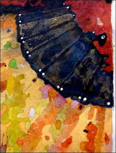
I used gold metallic acrylic to create the illusion of translucent panels in the dark part of the fan. Straight on, they're barely discernible, but from an angle you suddenly get a surprising gold sheen. (sort of reminds me of how the scene really was) I took this photo from an angle to show that, but of course you can't see the real iridescent effect on a computer monitor. The little white dots are small globules of gesso sitting on top, like pearls. I have no idea if they really existed, but they looked good to me, set off the darks, and strengthened the radial form of the fan. About the other elements of the composition: the line descending from the fan represents a post that was in the background, and I liked it. The pinkish part below that is a section of riser behind the dancer that had some lighting on it. Without those, the dancer looks too posed and unconnected to the surroundings, for my tastes. I could have painted a more conventional background, but I don't know if it would have been as dramatic. Also, this is the way it really was: the dancer shrouded in shadows, and set off by spot lighting. Note: I am a studio artist - I doubt I'll ever be a location painter. I'd have a hard time setting out to survey a scene with the intention of painting it. First of all, everything seems so vast and my eyes take in too much - I can’t process it quickly enough to hook it up with the myriad artistic possibilities. Music, which is the art form that has the most direct connection to my emotions, flows out of me more readily. Producing visual art is a delayed-reaction process for me, because I need time to assimilate all of the images fluttering around in my head. 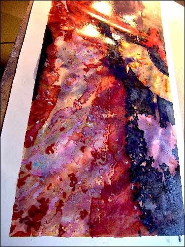
A problem I notice is that most people don’t “wrap” the subject in the background, and end up with the pasted-on look, or a situation where the subject and background don’t have any apparent connection. They then think it’s the background’s fault. Seen it in all kinds of work, especially florals and figures. Painting is the art of illusion, and it helps to remember, or at least pretend that what is behind the subject is also in front of the subject. Though I’m not a stickler for reality, I do like to see some cohesion between the two. In watercolor painting, it’s easy to integrate the subject and background with discreet washes over the subject - washes that wrap the subject in some places, and allow it to pop out and breathe in others. It also creates more interesting color variation in the subject itself. In this photo you can see I’ve added a wash over the entire painting, in a sort of streaked motif. With the spray bottle, I disperse the color in some places, and blot it out in others. When it dries, you end up with a more together-looking picture. Bright color is softened over here, and pops through over there. Adds depth, and gives the surface an undulating, alive look that puts the subject inside the picture. Then I loaded a brush with gold metallic pigment, dunked it in a bucket of water to make about a 1,000,000:1 mixture, to do another light wash. I'm careful not to use too much of the metallic, because it reflects light, and can obscure, rather than embellish. I try to get it so you just see the occasional random spark. Very hard to get a photo of that. 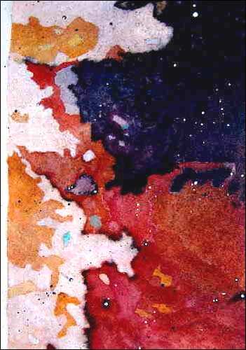
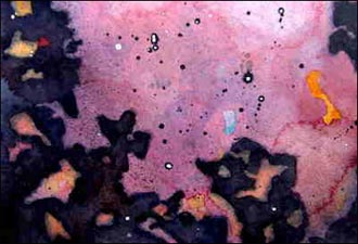
The next step is one of the more enjoyable parts: spatter. I'm referring to spatter that is applied for decorative purposes, not to accomplish fine shading or modelling (which is best done with the toothbrush). For large areas where I’m not too worried about accuracy, I like a flat brush. I hit the handle of the brush against the palm and fingers of my other hand - first on a piece of scrap paper to test the volume of paint coming off. The first bits are large and wet. Some times that’s the look needed. For finer spatter, I first knock almost all of the paint out. I vary the direction to suit the action of the painting. Depending on whether or not the painting already has a certain type of texture, I might opt for a whole different kind of spatter - the kind that looks more like drops of paint, without any direction to it. In that case, I like to use an old, limp rigger brush, loaded fairly heavily. I hold it over the section, and give it a light shake. That’s what I did on this painting. It’s a fairly controlled technique, despite the description. The whole spatter thing is something I’m now much more conservative with than in the the old days; I remember doing paintings that were more spatter than anything else. I used dark paint first, and then gesso. (It helped to have de Falla’s “La Vida Breve” blaring on the stereo!) One of my favorite tricks is to then go back and place a dot of gesso inside some of the dark ones. I first did this by accident a long time ago, when by chance a bit of gesso landed perfectly in one of those dark drops. The little “eye” that resulted made the dark and the white both stand out more. I was amazed. I then do the opposite in a few places - put a bit of dark paint in the white drops. These details keep the eye darting around. 
Then I used a few colors of metallic acrylic paint and ink to fill in some of those tiny white spaces. You can’t see the effect on the computer, so I circled where I did this in the photo. 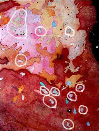
It's very easy to lose one's objectivity while spending a lot of time on a painting. Having other paintings going at the same time is a good way to "forget" about it. I looked at the painting after not seeing it for several days, and it seemed pretty clear what to do. I put another wash over the face and shoulder to integrate them with the background more. I brightened some of the colorful little bits in the upper background. I pushed the shapes under the fan back, and reduced the pink so it wouldn't compete with the pink in the dress. I think it's a lot better now. 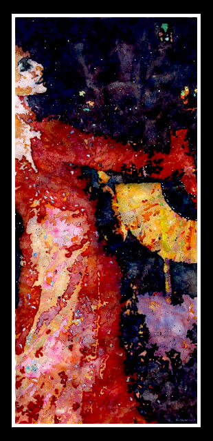
Tarantella 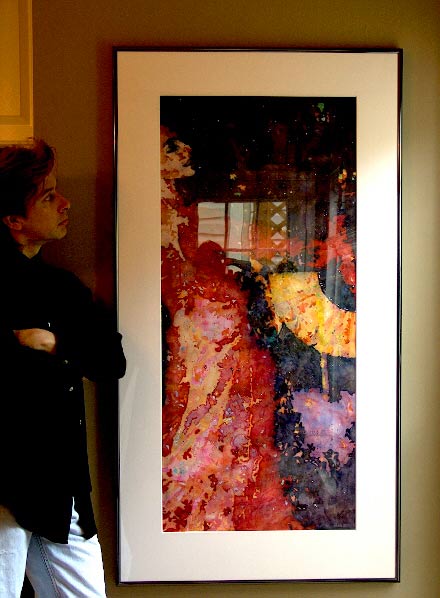
Framed, 32" x 60" 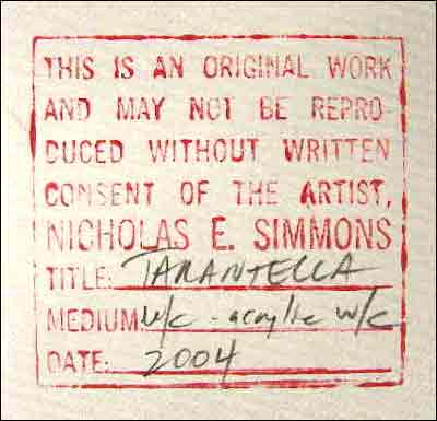 Back to Part One
Back to Part Two
Back to Part One
Back to Part TwoNicholas Simmons' website / Blog / Facebook Tutorial is copyright of Nicholas Simmons
|
|||||||||||||||||