SETTLER'S REST, PAINTING THE NEW ZEALAND LANDSCAPE |
||||||||||||||||
Memories of Taranaki - Oil Painting Lesson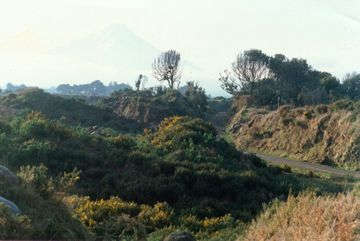
Although I enjoy painting outdoors, the majority of my most successful paintings have been done in my studio. I try to go further than to capture the essence of a moment and, where possible, I try to build a story into my paintings. Subject MatterSometimes I set out with an imagined mental picture and then go looking for suitable reference that will give the painting authenticity. Other times I go prospecting for good painting subjects. The demonstration painting, "Memories of Taranaki", is the result of one such trip. The low light was perfect one still winter afternoon. An ethereal Mt Taranaki presided over the land, majestic, disembodied, cut off from the middle distance by low cloud and mist. I knew my problem was going to be finding a suitable foreground. 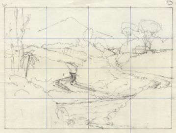
In these conditions, a camera is the only way to grab detailed reference. I found a reasonable rock strewn stream, climbed on to some rough ground above and beside it, was attracted to what appeared to be a rocky outcrop to my right. I ran a little further and found myself gazing over an old quarry site. Brilliant! Big old trees, remnants of the original native forest, still held out on the higher points. I felt I’d stepped back in time 80 years. A pioneer flavour seemed to linger in the stillness... I took several photos and left, knowing I had the basis for a very good painting. Composing the PaintingMuch later, in my studio, I studied the photos and began a small layout sketch. The subject still excited me but the composition could stand much improvement. The stream that had originally appealed to me needed to be shifted a few hundred metres and re-routed through my painting. I invented a winding, loose metal road, installed an old wooden bridge over the stream and then brought the road right across the foreground. The stream and road provided good eye paths, but I still felt that an extra focal point, other than the mountain was needed. Tucked over to the right above the road was an ideal place for a Victorian settler’s cottage. I drew one in then turned my attention to the foreground foliage. Instead of the sea of prickly gorse bushes which featured in the photos, I decided on some pasture, a number of native trees and ferns and lots of rank grass. By this stage I had come a long way from my original photos, but an exciting "walk-in-and-explore" picture story was all set to happen. TechniqueOver the years I’ve sought ways to combine the loosness and spontanaity of sketching, the freedom and accidental effects of watercolours and the richness and versatility of oils. 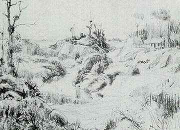
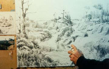
What I’m about to describe may seem dreadfully complex and time consuming; in fact its pretty straightforward and often results in marvellous effects, particularly in glowing shadow areas. Surface PreparationI used a 10cm house painting brush to give a 82 x 65cm sheet of hardboard two coats of gesso. On the second coat I was careful to use brushstrokes which were at right angles to the first coat. After a light sanding, the gesso provided me with a low relief criss-cross pattern, which was much smoother than canvas, but still provided good tooth, which is ideal for working in charcoal. CharcoalUsing a stick of willow charcoal, I sketched the painting up in a fairly loose style. Whenever I blocked in shadows, I was careful not to press so hard as to obliterate the interesting texture created by the brushstroked gesso. Acrylics and Indian InkNext I grabbed a 2.5cm pastry brush and turned the whole thing into a dreadful wash painting using transparent acrylic colours. I avoided using any opaque pigments (white, Naples Yellow, Yellow Ochre, Red Oxide, and so on) as these would obliterate the charcoal. To add further interest, I took a plastic spray pot filled with Indian ink and squirted little blobs of ink on to the picture surface. Some of these I softened back with a paper towel. I tried to restrict the blobs mostly to the middle and lower parts of the painting in order to keep the sky and distant mountain clean and soft. 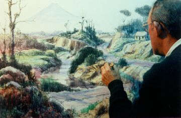
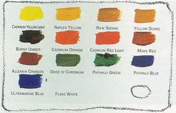
This is the point where my painting looks a real mess. The good thing is that it doesn’t matter how garrish or rough the preliminary work is because the next stage can pull it all together. Also, the "accidents" can be turned into interesting effects if allowed to show through the oils. Bits that dont work can be hidden by applying thicker oil paint. OilsI use a large wooden palette with a hard, polished surface. I always set all my colours out before I begin, and I always put each colour in the same position, an inch or two in from the edge which leaves a good space in the middle for mixing colours. Having a standard layout when setting out your colours is as important as having a standard configuration for the keyboard of your piano or your computer. On one corner of the palette I clip a metal palette cup half full of Archival brand Classic Medium. I’ve found this an excellent medium, particularly suited to thin glazes of colour. The colours I use most are Flake White, Yellow Ochre, Mars Red and Ultramarine. I use smaller quantities of Naples Yellow, Cadmium Yellow Light, Cadmium Orange, Cadmium Red Light, Alizarin Crimson, Oxide of Chromium, Pthalo Green, Pthalo Blue, Raw Sienna and Burnt Umber. The reason I use Flake White is because I want to minimumise flat or dull spots in the finished painting. Flake White acts as a primer, while Titanium White has the properties of enamel. I know that I’ll use at least 2 coats of oil paint so the rule is;- "Start with primer - finish with enamel". One other point. I’ve given up on cheap brushes. Lately I’ve been using Art Spectrum Definer series bristle brushes and find them excellent. Work from the TopI almost always start with the sky over at the light source (Flake White and a little Naples Yellow). Next, using the same large (No. 10) brush, I paint in the cool parts of distant land masses. I use a second brush for clean, soft highlights on trees or pasture. I use white, Ultramarine and Mars Red as my basic opaque shadow mixture. I progressively reduce the amount of white content in shadows as I work forwards and downwards so as not to cover up all of the interesting, blobby effects in the underpainting. 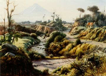
By the time I reach the forground, Alizarin Crimson and Raw Sienna (beautifully transparent) have replaced Mars Red (very opaque) in the shadows. I am careful to further enrich and warm the shadows the closer they are to the foreground. I also avoid putting on highlights until I’m satisfied that the shadow tones and colours are fairly right. Sunlit foliage has more and more yellow in it the closer it gets to the foreground. Some of the crisp, foreground highlights in the grass have been put in using a long haired, pointed sable "rigger" brush. I always use Titanium White with touches of Cadmium yellow and Cadmium Orange for such highlights. Fine TuningOnce the whole painting has one coat of oils on it, I generally let it dry, then give the whole thing a coat of retouching varnish. This increases gloss on the surface and does away with any chance of dull patches developing when I apply additional paint. With all of my landscape paintings, I like to invite the eye to go on a journey through space. This usually means that some middle distant parts need to be knocked back further. I do this with a very thin application of Zinc White (transparent), often with some Raw Sienna in it. The smoke haze from the cottage was created in this way. FramingFinally, I set the finished painting up under a very strong light and took the time to gaze and dream. The only thing left to do was choose a frame. Because most of my paintings have a fairly traditional flavour, I go for frames with a traditional feel. They must be wide, and usually incorporate either gold or silver leaf. Dont skimp when it comes to framing. A cheap frame around a lovely painting can downgrade it horribly! Visit Graham Braddock's WebsiteTutorial is copyright of Graham Braddock
|
||||||||||||||||
 I then took an aerosol can of workable fixative and sprayed the whole picture surface with several light coats so that the charcoal would no longer smudge when rubbed. (With this painting I made the silly mistake of not dusting off most of the charcoal near the skyline before spraying on fixitive - Result? Extra work covering it up with oils later).