Sketching light when travelling
An unexpected excursion forced me to travel light, so in impromptu fashion I grabbed a Kuretake Waterbrush, 2B pencil, Pentel brush pen, a Faber-castell 0.5 ink pen and W&N watercolour pan, the hardened type you have to scrub at to release the pigment. I also took an inexpensive leather bound sketchbook, hand-made somewhere in the Orient; it had been gathering dust for years, and never used. None are materials I particularly use, but as I was off in a rush I figured all you really need is a pen or pencil, and if the opportunity arose, I might be able to fill the waterbrush up and add some tone.
I wasn’t headed for anywhere particularly interesting, and with no real option for getting out and about (no car, and terrible weather), so I quickly printed off several thumbnail sized paintings I liked from various artists onto a couple of sheets of paper, folded them up, placed them into the sketchbook and went on my way.
The first of the small sketches was after German Expressionist Ferdinand Hodler. I drew directly with the faber-castell pen (I have no bias for this brand, it’s just what I had to hand) in a gestural fashion; it helps keep things loose. The paper isn’t really made with watercolour in mind, but it’s thick enough to accept a few washes – 2 or 3 are enough to get a good simplified range of light to darks. You can never be too sure how the paint will finish up when mixing a waterbrush into a pan, but it’s easy enough if you’re aiming for dark, medium and light. If something is too dark, you can always dab at it with a tissue, or water it down (and dab at it with a tissue) to lighten it.
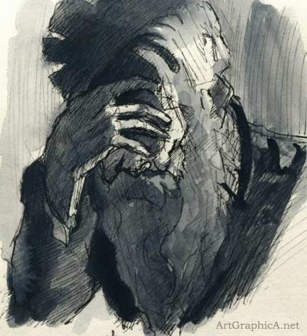
Larger Version: Ferdinand Hodler sketch
The Venetian architectural sketch was inspired from a watercolour by John Singer Sargent. Again very loose, trying to keep basic perspective in mind. The watercolour pan is not labelled, so I’m guessing it is lamp black; it tends towards a bluish tint.
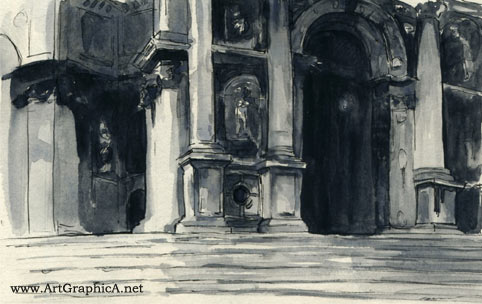
Larger Version: John Sargent Venice Sketch
These thumbnail sketches are after Childe Hassam if my memory serves correctly, and again John Sargent (on the right). The Childe inspired sketch was with the Pentel brushpen and Sargent with the Faber-castell. The size of it made the horse and figure a little fiddly because the only way to get a fine line is to hold the brushpen in a very vertical position with only the lightest of touches against the paper. If you work too often like that it is easy to lose the intent and looseness of a sketch.
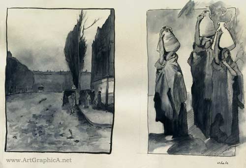
Larger Version: Childe Hassam and John Singer Sargent sketches
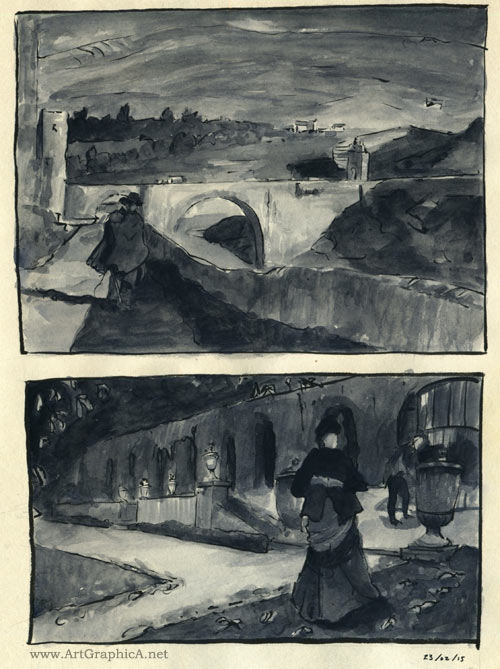
Last are some Pentel brushpen with wash sketches, which I believe are after Soralla (figure with bridge), though sadly the bottom one of the lady in the formal garden alludes me at present. It might be James Tissot, but don’t quote me on that. In the Sorolla that sense of downhill perspective to the bridge is achieved by keeping the vanishing point below the horizon line; if you put it above the horizon line you can achieve the illusion of something going uphill – basic perspective 101.
The brushpen keeps everything loose and jiggly and it’s easy to go from a fine edge to a fat one. By using the waterpen almost sideways on, you can cover large areas quickly to try and simplify the masses of shadows and light. Anything that’s a little smaller, such as the figures can be toned with a slightly more vertical grip.