OIL PAINTING LESSON, POPPY LANDSCAPE |
||||||||||||||||
Springtime Glory, Landscape with Poppies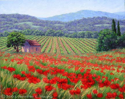
Springtime Glory, by Jennifer Young
Step One - A Rosy BeginningI begin with a toned canvas. "Why red?" , you may ask. Well, I don't always paint on a red-toned canvas, but it is something I often enjoy using with landscapes. I prefer a mid-toned canvas, which can be a neutral gray or mid range siena mixed with white (what the Impressionists called a "blonde" canvas). But red is also nice because it gives an immediate warm undertone and it is a compliment to the large amounts of green that tend to predominate in landscape painting. My beginning step is to sketch out my basic composition. I use a deep-brown purple (a mixture of ultramarine blue and alizarin crimson plus a touch of orange) and sketch with a brush thinned with turpentine.  Step Two - The Lightest LightsGenerally the sky will be the lightest element in the landscape painting, since it is the source of light. I block in the sky area first, to gauge the values of the rest of the painting. 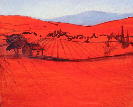 Step Three - Moving ForwardWorking from back to front, I continue the "block-in", with the closest mountains. At this point, there is still a lot of blue in this area, since the layers of atmosphere between the viewer and the horizon causes furthermost distances to be visually cool. 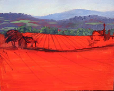 Step Four - Jumping AheadI know I said that I work back to front, but here I jump ahead because I wanted to block in my center of interest, in this case the little cabin, or "cabanon", the rusticly charming stucco and stone shed with a terra-cotta rooftop, an element so common throughout the Provincial countryside. I also want to define my darkest darks here, which in this case are the trees flanking each side of the painting. 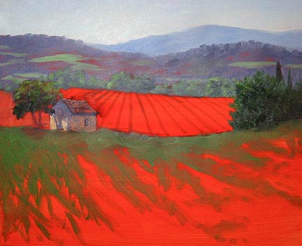 Step Five - Ground WorkNow I lay in the ground - the middle distant vineyards and the foreground poppies. At this point I have a pretty good idea in my mind about how the painting is going to look, and can get into the details. 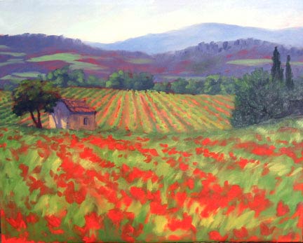 Step Six - In the DetailsI go back and lay some soft gray-greens into the mountains, and continue to emphasize my shadows and highlights in the cabanon and closest trees. 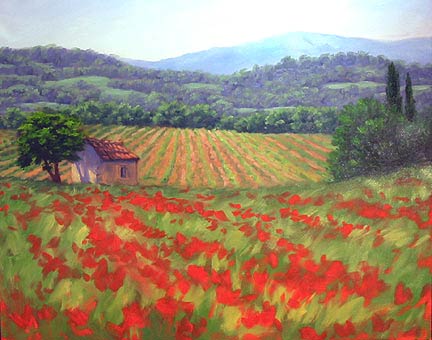 Step Seven - The Details in the DetailsThe red undertone that I started with has really helped me to create that warm stone look for this little building. I minimized my brushwork on the walls to let the red underpainting show through in places. Then I just needed to delineate the darks of the rooftop a little more and punch in some highlights, and viola! 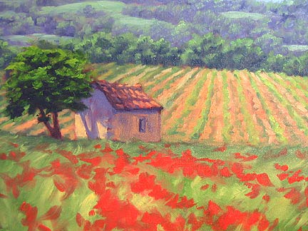 Step Eight - FinishingHere I have moved around the painting to do what I call "push and pull"- soften some elements to send them back into the distance, and emphasize other elements to bring them forward. At this point it is just a matter of finishing and tweaking. I may need to add some more darks to the undersides of the forward poppies, and further "grey down" some of the distant poppies. I may also make those foremost mountains just a tad lighter in some places. For the most part, though, the painting is complete! 
By Jennifer Young Tutorial is copyright of Jennifer Young
| ||||||||||||||||