Drawing Portraits From PhotosWetcanvas Basic 101 Class |
||||||||||||||||||||||||||||||||||||
Wetcanvas Guest Lecture by Reinhard
OverviewWhy did I get myself into this? Who do I think I am? I’m a beginner, whom do I think I can teach-tell-help-etc something. There are so many tremdously more talented people in this forum, bla, bla, bla. You will have heard and read this before, so I won’t get into this. Why did I do this? I think what drove me was the fact that I felt (and still feel), when I started out in WC that all the other people who post portraits are so much better than me I felt intimidated to post. I finally did and got much help but I wanted a foolproof “cook-book” for drawing portraits from photos. So I bought books and still didn’t find what I was looking for. I needed explanations why certain steps were taken, how they were taken and how mistakes could be overcome. So here I am trying to do this cookbook. I’m a beginner and still have a lot to learn but what I learned I wanted to share with you. I would like to take you on a journey from a photo to a graphite drawing; worth to frame and mount on a wall? I don’t know. I’m at the beginning and I don’t know how this will turn out. So this will be FROB-FORB (From Beginner – For Beginners). STEP 1Select your photo (BTW this could be the real test of friendship. If they are still your friends after you have drawn them you are either a gifted artist or they are true friends). And here I stumbled across the first problems. Many of the portraits I took were using a flash – so no real shadows. Recommendation: Select another photo, or if not possible, look for pictures with good lightening be they from the same person or not, no problem, just find something to hold on to when you get to the stage of shading. I would like to call shading – giving the face 3 dimensionality. Look in magazines etc. There is help to be found. Decide where the light is to come from and then select the material. The picture we will draw from is a photo of my lovely wife of over 34 years, taken a good 20 years ago. So there is another problem. I didn’t have this picture in digital form and when working with a computer to help with grids (we’ll come to that) it is helpful to be able to print it out. You might have similar problems, just scan the photo into the computer and work from there. 
Click to Enlarge
STEP 2Select the tools you are going to work with. Pencils (2B) – pencil sharpener – as an alternative a mechanical pencil (doesn’t need sharpening and you’ll always have a sharp tip) – a good eraser that doesn’t smear – kneadable eraser – good paper ( I tried many papers (from printer paper [DON’T] to sketchbooks, and have come to like Bristol smooth. Since I do have to do a lot of erasing the better the paper the more often you can erase what you have been doing and start all over again {and, if the drawing turns out to be really nice you can frame it and proudly look at it for years and you don’t have to say; ..” I wish I had used better paper so I didn’t have to draw the picture again which didn’t turn out as nicely as the first {experience!!!} – patience (they say practise makes perfect, I learned that patience is as important) – ruler (you will want to measure and measure and measure, and …) – circle template for the eyes (it helps to have a round iris [ I read in one in the books that the iris and the pupil of the human eye are the perfect circles in nature – how true !!!) – tortillons (paper stumps, Q-tips, tissue paper or whatever) for “smearing”. No fingers please, you’ll bring oil from your fingers to the drawing and that can become really messy {experience}. For this drawing I am using Bristol Drawing Board, A4 – 21 cm x 29,7 cm – 250 gm/m2 ( 8 ¼” x 11 ¾” – 113 lbs). This is the size of my scanner as well so it will be easier to scan the progress and share it with you. I will use a variety of pencils mainly 2B and B (wooden) and 0.7 – 0.5 – 0.3 mm mechanical pencils (mainly B and 2B as well). For some very fine lines I will use my silver pencil (just a silver thread). This has the advantage that I can draw very fine lines without smearing and since the line is very fine my mistakes are not that easily visible. For “drawing technique” I am using small circular strokes when shading a small area and when I want to avoid a harsh line (like on the upper eyelid). When shading, I am using circular strokes as well for the tortillon since I found that this gives a smoother area and is better when shading over lines. STEP 3Prepare your grids; one for the original photo or printout and one for the paper where you will draw on. The size of the squares depends very much on your drawing skill. The better you are, the larger the grids can be. I use/need a grid size of 1cm (1 inch = 2.5 cm). This helps me in difficult areas. I know that there are artists out there who will advise against grids. For me they are still and might be forever necessary. They help me to get the proportions and positioning correctly. I will always have to erase and redraw, but at least I have an indication where and in what size. On top of that, I am not such an artist (I won’t mention names) where one eye can be placed on the top of the skull and the other next to the chin, not to mention the nose and people will call this art and pay me a lot of money (sorry Pablo). When you draw your grid, use a soft pencil with a sharp point and draw the grid VERY lightly. It helps in erasing the lines later because you can’t always incorporate the grid into the shading. And then you go, square by square, and transfer the photo to the drawing paper. When you draw these first outlines please be very careful and draw the lines VERY softly and faintly. You might even try to just use very soft, short strokes versus a line. For me this works since I won’t have problems in erasing and when drawing short strokes I tend to really copy what I see versus what I think I see. Additionally there are no hard lines in faces. All is soft and smooth. The lines we draw at this stage will all end up in shading and not be visible in the final drawing. Take a look at all those beautiful portraits that have been posted in the forum and you will see not lines but shading and tonal values. Try to copy this. If you don’t believe me, take a look at the photos you are working from, where are there lines? See? The only lines I see on my photo are from the glasses and even these are a little bit fuzzy at the edges. (I have used tracing in the past but didn’t like it. The lines were too thick, the finer lines didn’t come out correctly, the likeness was not what I hoped it to be. Additionally think that you will actually make 2 drawings. One onto the tracing paper and the other onto the drawing paper. That makes 2 possibilities to go wrong in likeness. It might work for still lifes and objects where likeness is not of major importance. We humans have a very sharp eye when it comes to likeness. A fraction of a centimeter/inch will make the difference from head-on to I think I can detect that person. So for me it didn’t work and I don’t intend to follow that route). STEP 4Now that we have the first outlines we can already check if there is likeness or not. I want always to check if the outline of the face is correct, if the eyes, mouth and nose are placed correctly and have the correct shape. Draw, erase, draw, erase, draw, erase ….. until you are satisfied. This is the stage where mistakes can be easily corrected and make life so much easier. 
Click to Enlarge
This is the step where you will want to measure and measure and measure again if the proportions are right. Are the eyes correct? I have found that I tend to make the eyes too large either in width or in height. Somehow I still draw “eyes” and not the shapes I see. Same thing goes for the mouth. Check the correct placement of the corners of the mouth versus the pupils. If the picture is head on, the corners of the mouth are normally right in the middle of the pupils. What I have problems with is when the photo is not directly from front but the head is turned or tilted slightly that I sometimes forget that the eyes, although always parallel to each other, are not parallel to the main vertical axis. And that the “far” eye is smaller. I often forgot that and ended up with the feeling that something was wrong. As has been said above, fractions make the difference. I know that there will be a tutorial on eyes and I hope to learn a lot from it to help me furhter on. And the mouth! Parallel to the eye axis and as well the “far” side of the mouth will be shorter and curved differently. Make sure that you don’t draw these features copying just the left side to the right and vice versa. Eyes and lips are different on both sides. Take that into account. Check it out when you step infront of a mirror and check the both sides of your face. You’ll see. Unless you’re Ms/Mr Universe. I have read that we human beings tend to think of beatuy in people when both sides of the faces are very similar. I know, I am not!!! This is the result of having tranferred the photo using primarily the grid to the drawing paper and many, many, many corrections. For the corrections of size and positioning I have used 2 grids printed on an acetate. One I used with a sleeve to put the original and the acetate in to have something to check. The other I used to put it over the drawing to check where I was off (and was I ever!!! Not really major differences but enough to affect likeness). Additionally I used the scanner. When you are good then the scanner is your friend because you can quickly see if you have achieved the likeness you wanted. For me it was a shock to see on the screen what looked acceptable on the drawing, but was obviously off. Other ways to check for accuracy is the mirror. I used it as well but didn’t find it as helpful as the scan. Since I don’t have a mirror next to my drawing table I had to run back and forth to make changes to see if I got it right. The scanner on the other hand is right here at my drawing desk (I often use the screen for the original drawing) and therefore it is easier for me to correct and scan and re-scan and re-scan (you get the picture). What had helped me however tremendously was the Photoshop method to check the drawing against the original. There is a feature by Cathy_Sheeter explaing how it is done. “Using Photoshop to Evaluate Preliminary Sketches, dated. 10-13-2004”. Highly recommendable – it helped me a lot. I have outlined the forms a little bit stronger so that they would show up in the scan. I usually try to do those lines as faint as possible to be better able to incorporate them into the picture. And yes, try to get rid of the grid lines now, since they will bother us later on when we are going to shade. STEP 5Being at this point we are happy with the outlines (I presume) and now the fun part begins, the real drawing. I take it that you all have erased carefully the grid lines from the drawing and you look at your masterpiece as if you had drawn it freehand (which you did – with just a little help). 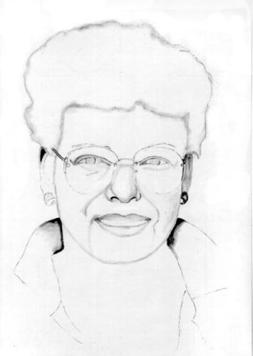
Click to Enlarge
Now where to start? That is very much up to you. Some start at the left uppermost corner and worked their way down to the right hand lower corner (for right handers – left handed persons would start on the upper right hand corner to go to the left hand lower corner). They say this prevents, or at least reduces, smearing. I can’t do that. I don’t have a fixed starting point. I mostly start with the eyes and then jump around from there. (To avoid smearing I always use a paper under my hand over the areas I have already drawn.) And jumping around I really do - from the eyes to the nose, to the eyes, back to the mouth, the ears. You get the picture. It helps me to concentrate always on very small areas of the drawing and not fall into the trap to drawing an eye but just some small part of a line on the left eye, etc. It helps me to focus on smaller areas. Additionally I very often don’t draw continuously for hours. Sometimes I draw for a few minutes, play something on my keyboard or Solitaire and then come back with a fresh eye and a more critical look at what I did. Recently I have found out that I like to draw the outlines with a tortillon (pointed paper) with graphite on it. It helps me to get more form into the picture, it is easy to erase, and it helps me to see the shapes better. With this I sometimes lay the first shading giving the portrait it’s first 3 dimensionality. Remember, the head is round and not 2 dimensional. As said, I have outlined the drawing using the tortillon. As well I have applied the first tender shadowing to make it more 3 dimensional. As well I have made the dark areas already very dark to give me a better impression of how the face will stand out. 
Click to Enlarge

Click to Enlarge
In shading I am learning as I do this project, it works for me to draw the shading not in cross hatching strokes but in small circular motion. This enables me to handle the pen very lightly and avoid deep impressions on the paper. As well it will blend very easily for a smooth shadow. Additionally, when I “circle” over already existing hard lines it makes it easier to blend these lines into the shading. But be beware of shading circles on shading. Be very careful since graphite appears to adhere to existing graphite a lot better than on paper. So a lot less is better. Try 2 or 3 layers vs on which might come out too dark. IMPORTANTISSIMO The further back, the darker. As simple as that. Here now comes the reference photo into play which we selected for the shadows. Use these as hints where to place the shading. Please observe that you have to match the contours of the nose for instance with your photo and not with the reference. Chances are that those noses are different. And now area by area we will apply tone (graphite) to our drawing. Keep in mind that there are some highlights in the face. Leave them lighter, or dab them off with the kneaded eraser. Have reflections of light on the lower lips (upper lips are mostly darker), on the cheekbones, at the side of the face (reflected light), and don’t forget the hair. Somewhere I read that drawing the hair takes as much time as the rest of the drawing. Right! If you wanted to do it correct, it takes time, but makes a whole world of difference. Look at the hair not as a sum of many individual hairs but as shades and reflections. Easier to draw and more natural. (You will see later non that I have not been able to follow my own words through and I am struggling with the hair. Hopefully somebody will do a piece on hair.) In the following stages you can see how I have, step by step expanded the area of shading. (Not to the complete satisfaction of the WC community, but this is one of the areas in which I, as a beginner, have serious problems. I am afraid to go dark enough with my darks and often end up with a rendering in the “middle-tone-area”. So be beware of that !!!!)

Click to Enlarge
Speaking of difficult areas. One of my problem zones are the mouth and the teeth. What had helped me especially with the teeth is that I don’t draw them any longer. I just draw the negative space between the upper teeth and the lower teeth. Try it you might be surpsrised how easy that is. When I showed this stage to our daughter she told me exactly where to put more shadowing: In the areas on both sides of the mouth and the forehead. And voila !!! there is more 3 dimensionality in the face. Before that it looked as if the mouth was just “pasted onto the face” and did not really “belong”. So what does that mean? Check very carefully if you really have all the shadowing not only in the correct intensity but in the correct places as well. And then the real problems started: I tried to do the hair ( henceforth known as my “hairy – problem” ).
And here is the stage I am at: 
Click to Enlarge
I have posted this stage in the forum to receive comments to help further improvement. These are recommendations of the areas which still needed improvement: 1. Darker shading 2. Deepen the recess of the hair 3. "Eliminate" hint of lower teeth 4. Hair 5. Tonal values vs. reference picture are off 6. In connection with 1 and 5 - start with a very dark area and balance the rest of the drawing out according to the deepest dark So here we are. I will try to incorporate now as many of those suggestions as possible without ruining the drawing completely. Yes, it was fun. I hope I was able to share some things with you that might give you the one or the other idea. As said above, do I frame it and hang it? I might do so. Thankfully I have a loving wife!!!!!! Cheers and happy painting, Reinhard Artist's Bio A little bit about me: 
My name is, as can be seen above, Reinhard. I am 62 years and retired since about 3 ½ years (my my time flies). I have worked in pharmaceutical marketing and loved it. All my life I have been convinced that I can’t draw. (You might agree after having seen the above article). Still, I always doodled but never drew. I don’t have any formal education (artistically that is) and just started with books and WC. What I really wanted to do was watercolours, but realized very quickly that watercolour requires a good drawing and so I ended up in this forum. And after drawing and drawing and drawing, I saw an improvement. So I was brave enough and started to post which finally got me into the situation to write this piece. It was fun and I learned a lot. See ya at the forum. Article, Copyright Reinhard, 2005
|
||||||||||||||||||||||||||||||||||||


