The Art of Thumbnail Sketching and Compositional Value Studies
Self-taught artists have the arduous task of planning their own routes. Usually there isn’t a great deal of methodology, so stumbling around in circles and getting lost in inefficient pursuits is the usual norm, before discovering which paths lead to the most efficient means in which to gain forward momentum. If I could turn back the clock there are many things I would change in my approaches, not least of which is years of inactivity (partly born from frustrations and partly from the distracting demands of daily life). One thing that has been long overdue is the practicing of thumbnail sketching, and I shall attempt to explain why it’s one of the most invigorating means for developing your skills.
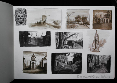
I do not know the reasoning behind the name. You couldn’t draw much in something the size of a thumbnail, especially without serious eye strain. ‘Thumb sketches’ would have been more apt, as they generally range between 1.5 inches to 4 inches. They can be as simple or detailed as you care to make them – even a few lines and strokes placed in under a minute can serve as a guide to better understand a scene. My ‘thumb sketches’ are more detailed than they need to be, predominantly as I used them as studies to improve drawing, freehand perspective, composition and basic values. With thumbnails you can kill several birds with one stone; their small size means you can create many small studies in the time it would take you to finish something larger, and hence cram in a lot more experience – great too for those on limited time. They’re also really cheap, for those on tight budgets.
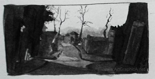
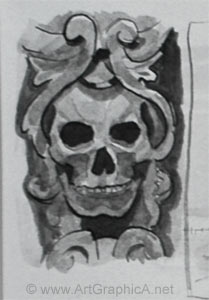
The thumbnail sketches in the first picture above are executed with a traditional pen nib and holder, and a cheap bottle of black shellac (waterproof) and sepia ink in a moleskine watercolour sketchbook). I have tried several nibs, most recently the hunt 100, which proved to be scratchy and impractical on a slightly textured watercolour paper (had I bothered to read the description, then I would have already known this!). My favourite nib is so encrusted with dried ink that I’m surprised how well it works. I believe it is a Gillott, but cannot make out anything more. Pen nibs are cheap, so you can always buy sample packs and experiment. When you receive the nib, you should give it a light scrub with an old toothbrush and washing up liquid to remove the coating, and encourage the flow of ink – neglecting this, the ink tends to stick inside the nib and defies gravity, leading some to give up before they even start. Some of the sketches have been done with sepia ink (two are rough copies after Rembrandt the rest are from photographs of Pere Lachaise cemetery in Paris).
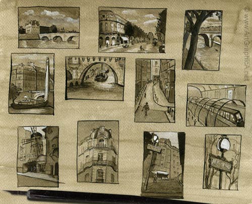
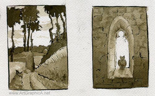
The Paris thumbnails are the smallest at just under 1.5in by 2.5in. I stained the watercolour paper (this is from a cheap German made pad) with diluted sepia ink first and used gouache for the highlights. The other sketches below are simple studies of famous paintings, from Francisco Goya and Winslow Homer to Anders Zorn and Caspar David Friedrich. For these, I used a Japanese Pentel brush pen for the first time. The ink flows nicely, and is a deep rich black. It creates a good variety of line, but I don’t favour it as much as a pen and nib. It is certainly a more practical pen for outdoor sketching though. I tried to contain the values to approximately three (you’re probably crying out, I can see more than three! It is true; there is a little more variety than that but mainly due to slight inconsistencies in the ink and going back over areas that didn’t work properly in the first ink wash).
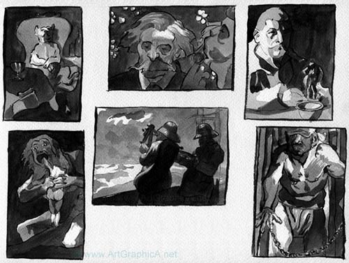
When looking at the originals, you need to squint and break down the values into light, dark and mid-tone. I painted the tones using a slightly oversized watercolour brush. Initially I dipped it straight into the ink bottle and laid down all the darkest tones in as few brush strokes as possible, afterwards diluting the ink with water to a mid-toned grey, leaving the white of the paper for the lights. The result is an instant impression and a basic breakdown of the overall composition. This provides a great means for studying, because these old masters have already done all the hard work for you, and in practicing you gain a better eye for how they composed their tones to create an impact.
Working from photographs is much harder in many respects. Photographs are an incredible resource, but unless you’re a photorealist, they are also the enemy, rendering far too many details, creating distortions, destroying values (not that this really matters for thumbnail sketching) and rarely providing ideal artistic compositions. You will need to pick and choose the elements you include, simplify shapes and foliage and if necessary deviate from the source in terms of improving light and shadow. Sometimes it works, sometimes it doesn’t, but this is why thumbnail sketching is so useful, as it provides the opportunity to practice and adapt. If something goes wrong you simply try again with minimal wasted time, and any sketches that jump out at you can form the impetus for a more developed painting or drawing.
I will try to create a future tutorial to properly explain my methods step by step. Whilst I used pen and ink (an unforgiving medium, but one that adds instant drama and impact), thumbnails are suited to almost any medium out there, from watercolour, to pencil and oils. I cannot recommend the practice highly enough.