THE PRACTICE OF OIL PAINTING |
||||||||||||||||
|
Page 03 / 09
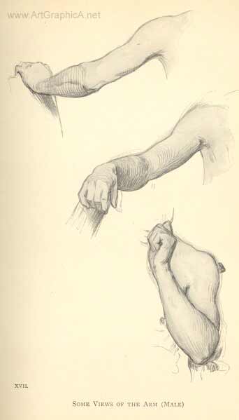
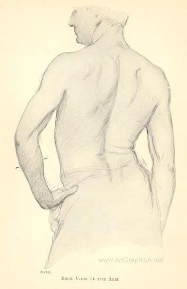
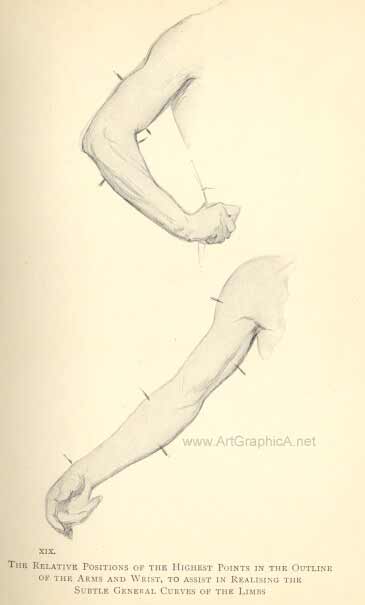
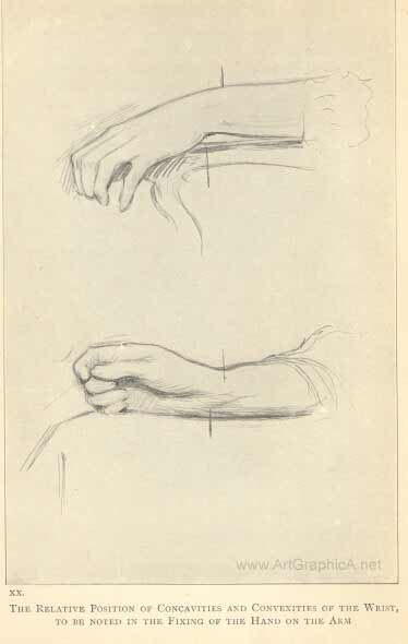
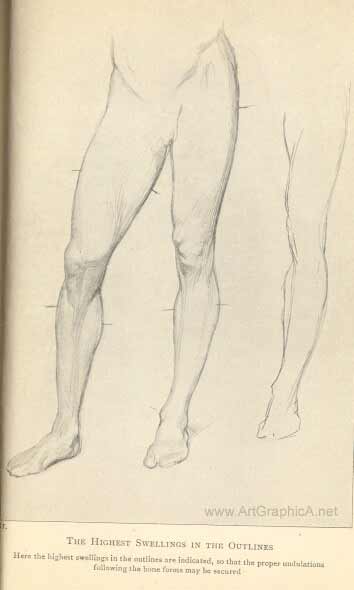
 CHAPTER V THE ARM AND HANDS-THE LEGSThe fixing of the hands on the wrists presents exceptional difficulties. I shall therefore endeavour as briefly as possible to point out some means of overcoming them. The anatomy of the arm should, of course, be mastered, but the rotary movements of this limb and of the hands, and the subtle changes that the slightest shifting of them gives rise to, make it impossible without the model to render the infinite variations of their lines and modelling. Make it a rule never to draw one side of the arm without comparing it carefully with the other, so that the area contained within them coincides with the area under your eye in nature. [56]A capable writer on art matters makes use of this sentence :- "We have seen that if the linear draughtsman made his lines right in length and direction, the areas enclosed by them must of necessity be the correct areas ; although he may never have given them a thought." I certainly join issue with the writer in his afterthought. You may take it for granted that neither the length nor the direction of the outline will be quite correct if thought be not given to the mass enclosed at the time of drawing the outlines. There are but few flukes to be counted on in drawing, and if the mind is not assisted by every possible consideration the chances are that at some point the drawing will suffer. The unobservant student too often makes the lower arm look like the neck of a bottle, making it taper too suddenly towards the hand-the subtle curvatures of the arm are overlooked. I have made a few drawings of the arm, just to show the general tendencies of the upper and the lower parts of the limb. The points to consider are indicated by the marks against the outlines in three of the drawings, where the highest swellings of the lines are to be found, on the opposing sides. In Nature these highest swellings are rarely seen exactly opposite each other, and this variation accounts for the curvatures already alluded to. In the placing of the hand on the wrist, mark [57] carefully the relative position of the protuberances on the one side and concavities on the other. It would be well for you in your studies of the figure to take up the arm and hand, after having settled their proportions, during one complete sitting. They are rarely posed twice alike. Their capacity for movement is endless, and is responsible for most of the conscientious painter's grey hairs. No wonder Van Dyck told his friends with some glee that he had at last found a model with a good hand who could pose it well. While working in England as Charles I.'s Court painter, he obviously used this model for most of his hands. The graceful sitter, as he found, gives no great trouble, but the " stick " is hopeless. The awkward sitter's hands are frequently hardly recognisable as hands. Still there is always something so individual about them that, when at all possible, you should let your hands be the hands of Esau, and not a substitute.
XVII.
XVIII.
XIX.
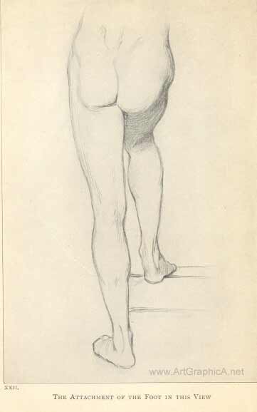
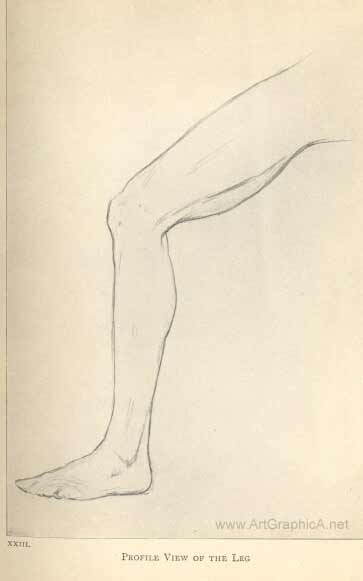
XX THE LEGSThe instructions given for the drawing of the arms apply equally to the legs, the main points being a comparison of the relative swellings and undulations of the lines on either side of the limb, which are rarely exactly opposite each other. In the front view, follow closely the bone forms, particularly the tibia, from the inside of the knee [58] to the inner ankle-bone. When the weight of the torso is thrown on either hip, see that the foot plumbs well under the head, and that the legs and feet are always firmly planted. For this your plumb-line will be found most useful. In studying the foot you cannot do better than draw from a good cast. When working from nature you must draw all that you see, in spite of the imperfections of your model ; but when you wish to idealise you will find the antique your safest guide. You will note that the Greek sculptors elongated the middle toes so that they project beyond the great toe ; but do not look on antique sculptures as so many models from which to learn drawing and tone. They may serve such purposes in your early studentship, but far higher lessons are embodied in them-the perfection of human form, grace, and dignity, all that is most beautiful, simple, and inspiring. My London readers would do well to study the Elgin marbles in the British Museum, the seated figure of Demeter, the benevolent Mausolos, the Hermes, and many other figures and fragments, as well as the busts of Roman workmanship, and the shapely Greek vases with their decorative designs.
XXI.THE HIGHEST SWELLINGS IN THE OUTLINES Here the highest swellings in the outlines are indicated, so that the proper undulations following the bone forms may be secured
XXII. THE ATTACHMENT OF THE FOOT IN THIS VIEW
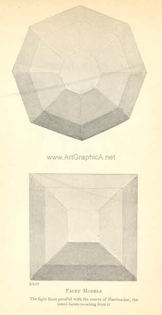
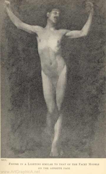
XXIII. PROFILE VIEW OF THE LEG [59]CHAPTER VI LIGHT AND SHADEWhether the pre-Raphaelite painters were ignorant of these signs or purposely ignored them is not certain, but Leonardo da Vinci blames his contemporaries for their ignorance in this respect ; and we might conclude that he was amongst the first to discover the part played by light and shadow in producing this sense of the solid. The elementary principles of chiaroscuro are now patent to all artistically cultivated minds, and my readers, I feel sure, understand them up to a point. The distinction between definite light and marked shadow is sufficiently obvious ; but that a painter's modelling is due almost entirely to the knowledge, and a capacity to use that knowledge, of tone relations, is not generally appreciated. Yet modelling is perfectly simple [60] to understand when the main governing principles are grasped. Plates XXIV. and XXV. should make the matter fairly clear. Here we have objects, the surfaces of which are composed of a large number of planes or facets. We shall see that the facet parallel with the FIG. 12 source of light predominates, and that the others, in proportion as they recede from the source of light, are toned and shaded. Objects are not all composed of angles and the planes made by them, as in these examples, but the underlying principle is the same whether it is applied to curves or angles, the tones being only more suavely merged in the former case. This I have endeavoured to demonstrate in the study of a man, here reproduced. The lightest passage, on and above the arch of the ribs, is parallel to the light; the tone above marks the receding plane of the pectorals ; and below, the general plane of the abdomen that falls [61]in towards the legs. The upper part of the legs advances again to the light, toning as the legs curve slightly under towards the knees, the left lower leg protruding again and offering a surface to the light, so that the waves of surface are seen as it were to undulate from the head to the foot.
XXIV. FACET MODELS The light facet parallet with the source of illumination, the toned facets receding from it
XXV. Figure in a lighting similar to that of the facet models on the opposite page. The relative values of light and tone are entirely responsible for this appearance of advancing and retiring facets. We shall see by this study also that passages furthest removed from the light centre, although they offer some planes parallel to the light, are generally lowered in tone, partly because of their greater distance from the light centre, and partly because of their local tones. The head, the feet, the knees, and the lower part of the abdomen are generally richer in colour, and therefore lower in tone, than the rest of the figure. With but few exceptions, every figure or solid object has one predominating light passage, and it stands to reason that every other passage must be lowered in relation to it, however delicately in some instances, to enable it to predominate ; and the same applies to the tone value of shadows. It is the realisation of the delicate differences of tone throughout the object painted, or throughout a picture containing many objects, that constitutes, in respect of light and shade, what is known as " breadth "-that is, au fond, that every part takes its right relative position, and its proper subordination to the main light or object [62] lighted. There is a lesson in what Sir W. S. Gilbert, the playwright, says : " Where every one is somebody, then no one's anybody." To the uninitiated it is sometimes difficult to distinguish the predominating light from others that are to all appearance equal to it in brilliancy ; but there is one unfailing method by which the relation of all the light and shaded surfaces can be so distinguished, and that is, by nearly closing the eyes when examining the model or subjects under observation. If, for instance, two light passages appear equal, the lids must be brought closer and closer together until one of these passages is almost lost to view. This will readily settle the claim of the lighter passage to distinction. The same method is applicable in arriving at a similar decision with regard to the relation of shadows, all intervening tones, and the general tonal aspect of the whole figure- in fact, of everything within range of the eye. Once this method has been thoroughly grasped, there will be little more to learn about the theory of light and shade and tone values. There are, however, some matters to be considered in connection with the rendering of these tone values in painting or. tone drawing ; for instance, where there is a light too brilliant to be rendered by pigment or clean white paper. A bright sky, to say nothing of the sun itself presents to us such a problem. If, with our eyes half closed, we compare this sky with the earth, trees, and so on, we should [63] reduce the earth to a tonality that would deprive it of all sense of the light that is playing over its surface. Here a compromise must be effected, the kind of compromise depending entirely on the temperament or the taste of the artist. He would not care to sacrifice the light on his landscape by way of conceding to his sky its approximate brilliancy. On the other hand, he may not see his landscape independent of its relation to the source of its lighting, as is so often done by those who are ignorant of the value of tone relations to their art. He must therefore settle the degree of lighting in his sky and of the tone of his ground which is imposed by the limitations of his materials. Although as a general principle the value of tone relations must never be overlooked, we must be careful not to become pedantic about them. There are some painters who, in painting a woman with brilliant diamonds about her, reduce the flesh tones and all others in endeavouring to give due value to the brilliancy of the jewels. In such a case the taste of the painter must decide the quality and the extent of the necessary compromise ; but where the predominating light passage is obtainable without strain, be guided by it absolutely-the quality of your surfaces demands it : for example, the high light on a white porcelain vase reduces by contrast what would be a white surface without that shining light to a low-toned one. The quality of the glaze is thus seen in nature, and thus rendered in painting or drawing. [64] The reproducing of every kind of texture depends partly on drawing, but mainly on the tone value of their light, half-tone, and shadows. This will be clearly seen in a photograph of flesh, silk, satins, metals, and the like. Colour plays no part here, but tone alone is sufficient to render with the utmost fidelity such textures in the photographic print. Photography is unwarrantably abused in our day by some painters, and I warn you most seriously about using the camera illegitimately, and so becoming the real camera fiend. But if you would learn the importance of tone value in your art, study photographs (not of your own making) from this point of view, and you will learn many a good lesson both about textures, modelling, and aerial perspective. As an exercise in aerial perspective draw an interior, carefully contrasting (by the eye-closing method) the relative values of the objects in it, and be satisfied with your drawing (of course a toned one) only when you are, or rather when another person is, able to say that this chair is just so many feet away from the wall, or that other object so far from the chair, and so on. I take it, of course, that your knowledge of linear perspective is adequate. If the room is lighted from behind you, you will find as a rule that the nearest lights and the nearest shadows are stronger both in tone and colour than the more [65] distant ones, even though their surface colours are unequal. Do not attempt to paint or draw a figure, or any object, except the setting be that which you wish ultimately to realise. The tone of the setting or background is as much affected by the main object as that object is affected in tone by its setting. They act and react on each other, and the subtle differences thus brought about make all the difference in the quality of your drawing or painting. Except perhaps in decorative or in imaginary subjects, keep to this rule ; and even in the carrying out of such work, be aided by nature's tones wherever it is possible, or your surface quality, its weight (or solidity), will suffer. To this subject I shall have reason to return in the chapters devoted mainly to painting. When you have mastered the foregoing lessons and have learned how to apply them, then and then only would I advise you to take up your palette. Colour has a fatal fascination for us all ; it will not spoil for the keeping. Lay a sure foundation for your house, or the superstructure, which painting is, will be futile and of no avail. [66] PAINTING MATERIAL COLOURSBY the system of apprenticeship that obtained during the Renaissance and in those now regretted days when the decorative arts flourished in Europe, the knowledge of our craft was handed on from master to pupil. Those valuable traditions are to-day but a faded memory ; but such is the spirit of the age, that even did the unbroken chain of tradition reach back to the fifteenth century, when oil-painting first came into general use, its sanction would probably be questioned and its teaching neglected. I shall have cause to refer throughout these pages to some of the many forces that are at work and have inspired this breaking away from all workman-like traditions. Chief among these disintegrating influences are the modern cult of realism, the multiplicity of art exhibitions, the not unmixed blessing of the advance in chemical science, and the superstition that because of the opacity of pigments corrections can be ventured upon without due preparation. The thoughtful among us have for some time past felt anxious about the methods, or rather [67] want of method, by which so much modern work is produced. Teachers have been too superior, perhaps too uncertain themselves about their craft, to do aught but, teach and criticise æsthetically, and have left the student to shift for himself and learn his trade as best he might. No one about to take up painting as a profession should be left in ignorance of the dangers that beset him. He will be saved much heartburning and many futile experiments if he but know at the outset what is detrimental and what should be avoided. Let us see how far the cult of realism has affected modern practice. Painting is begun with little forethought as to the method to be pursued. A settled plan would hamper the painter who is willing to fall in with nature's ever-varying and wayward moods, so that after an attempt partially to paint one aspect, he is induced to make the changes invited by the passing fascinations of another. Little harm might come to the work were each succeeding variation studied apart, and one of them eventually selected, put in something like artistic order, and completed. But no ! with an utter carelessness of eventual results, one painting is imposed upon another, until the desired realistic feeling is achieved. I have referred to the supposed advantages that oil-painting has over other mediums, insomuch as [68] changes can be effected without erasing or making preparation for the passage over which the change is to occur. This fallacy ought to be exploded. The practice is most pernicious, the more so because the mischief is delayed and not apparent. To begin with, it is almost impossible to get away from the moral influence either of the colour, tone, or drawing of the existing surface. And also, physically, in the course of time these make themselves felt through the superimposed layers of pigment. You may take it for granted that no sense of freshness can be preserved after three, or at the utmost four, coats of a similar tint have been laid solidly over each other on the canvas. Besides, the grain or texture of the canvas is your best friend, and when this is gone (that is to say, when the pores have been filled up with solid paint) all attempts to regain clearness or freshness are hopeless. If we resort to the scraping of the paint with a razor or knife the surface becomes slippery, and no tooth remains to help us with our modelling. I shall, however, add to the list of materials by advising you to use a scraping tool called steel plush mat. I know of nothing better to enable you to erase your painted errors and to renew a texture. But the wisest course, when a canvas is loaded in the wrong places, is to take up a fresh one, trace on to it whatever is worth preserving, and paint on it de novo. This really saves time, and gives you fresh hope. [69] Let us now inquire into the effect resulting from our oft-recurring exhibitions of painting, and see how they influence the painter. So many of the qualities considered essential by our masters are sacrificed for effect. An obtrusive coarseness is now preferred to the velvety surface of the Dutch masters. Scene painting, effective enough on the stage, and perhaps telling on the great walls of our exhibitions, is taking the place of precious workmanship ; and, worst of all, these exhibitions engender a never-ending restlessness and love of change for the sake of change. Anything with which to astonish the native ! Fashions in painting come and disappear like Paris hats, so that last year's methods are as out of date as the headgear that went with them. Many bids for fame are made by men who, having nothing to say, invent a new language to say it in, and hope that their jargon may be mistaken for originality, as it not infrequently is by the immature critic and the modish amateur. There is no end to the possibilities of what is known as imagination-that is, the power to make fresh combinations of existing facts and ideas. But there comes a time when the language, either literary or graphic, in which ideas are clothed may be considered fully developed, and the purity of it must suffer by the introduction of unsanctioned changes or a breaking away from its accepted law. There is, however, ample scope for the manifestation [70] of distinctive personality within its fairly defined boundaries. Painting may now be said to have reached its full development. From Van Eyck to Velazquez, from Titian to Gainsborough, from Rubens to Ingres, from Watteau to Bastien Lepage, is indeed an enormous field. There is little need to seek further for models on which to base artistic expression (that is the language of the artist). Abundance of scope is to be found within this field for every personality to assert itself, for every worker to preserve his identity. Gainsborough was buoyed up in his last moments by the thought that he would meet Van Dyck, his hero, face to face in another world. What could be more personal than Gainsborough's delightful expression, in spite of his hero-worship and the inspiration he sought from the work of the master he loved? Why need we paint in imitation of Berlin wool needlework, put our colours down in marked variegated spots, try every trick hitherto untried, if not with the hope of augmenting the pages of the artistic slang dictionary, and writing large our name across them ? There is perhaps a curious fascination in novelty ; but let us count the cost of "rushing in where angels fear to tread," for we may be branded with the appropriate epithet. Leave the poseurs severely alone, and see to it that your methods are sane though modest. Your tether is a very [71] liberal one ; don't strain it to snapping point by trying to realise effects that are beyond the limits of legitimate expression. Remember too that the " modernity " so beloved by some of the critics is the last thing to strive for ; it is of necessity the first thing to pass away. This does not mean that you are to stand still. There must be signs of evolution in all art that is living ; but surprising novelty is not necessarily a virtue. Originality is not affectation, but the frank expression of a personality. MATERIALSGROUNDS.-Your canvas should, except for work on a small scale, not be very highly primed ; colour slips about on a smooth surface ; it gets no hold ; a distinct tooth is a necessity. Your choice of a canvas depends largely on your method, and frequently controls it ; for instance, if you have a desire to paint fatly, a slight texture would be better than a rough surface, which absorbs too much colour to allow of an unctuous manner, at least until a later stage when the grain is partially lost under successive layers of paint. I should advise you to try a variety of textures to find out by personal experience the most sympathetic ground. It is well to learn to feel "at home" under varying conditions, for a coarse canvas on which you might paint the head of an old man would hardly be suitable if a child's face [72] were your subject. However, it is wise for a student not to go to extremes in his selections. Except in the case of studies for more important work, do not paint on toned canvas, for the reason that it is difficult to evade the moral influence of a dull ground. It makes for dulness, while it flatters you that you are painting brilliantly ; but for rapid studies it has its uses, the background being to a certain extent already indicated. For this purpose I have found brown paper, stretched over common canvas and then sized a delightful ground for studies in oil or guache. The wood panels made to fit into the lid of the paint-box are of a pleasant warm tone, and are to be recommended both for landscape sketches or small figures. If you find after some experience that your work inclines to soapiness, you may correct this objectionable tendency by using an absorbent canvas. The thick wood panels used by the old masters are rarely painted on to-day, but for small, highly finished work they are preferable to canvas. Let your palette be not less than eighteen inches in length ; rather more is advisable. Personally [73] I prefer the dark pear-wood to the light maple palette ; for on the light yellow surface it is hard to recognise the real nature of the colour which you are mixing. Among your brushes, have some of the shape shown on page 72.
These flatted round brushes, coming to a blunt point, are sometimes called Leighton brushes. With them, the drawing of detailed passages can be effected, and fewer small brushes will be needed. Avoid the use of many small brushes in life-size work, and get used to large ones of an inch or more across. Try all kinds-flat and round of a medium thickness. There is no resilience in a thinly haired hog-brush, and a fat one absorbs more colour than it places. Let your palette knife be fairly long-you will see the reason for this recommendation later on -and let it be trowel-shaped.
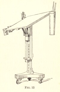
When painting large surfaces, you will find a painting table, like the one reproduced on page 74, very useful. It can be easily moved, lowered, or raised ; and it offers a much larger area for the mixing of quantities of colour than any palette you could hold with comfort. With the same object a number of shallow saucers, which can be filled with colours mixed [74] to the approximate tones required with medium are serviceable. Charcoal is used for the initial drawing on canvas. The wire plush mat which I have already mentioned is quite the best kind of scraper. With it you can erase the paint, particularly when dry, until the canvas is bared; and at any stage it can be used to restore a texture that may have been lost. The wire plush mat can be purchased at tool shops, and is sold in lengths. The shop assistant will cut up the lengths into shorter ones [75] for you, a six-inch length being what you will find most handy. This mat is used mostly by plumbers. Its use requires a little experience. I ought to caution you never to scrape your work until you have placed a stout cardboard between the canvas and the stretcher, for the pressure will otherwise force up ineradicable ridges in those parts of the canvas that lie over the edges of the woodwork behind. Good pictures are frequently spoilt because of the lack of this precaution. Your easel should be the best you can afford. Let it be light and run on good castors.
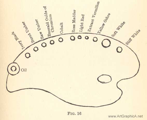
COLOURSThere are two methods of painting I wish you to learn. The one is painting in "grisaille" or monochrome, and subsequent glazing and scumbling with colour ; the other is direct colour reproduction. The former method needs but a very simple palette, the other a much richer one. I shall recommend a list from which the colours for either method may be selected, I think, with safety, avoiding inclusion in it of any pigments considered doubtful by the chemists, and including the least harmful among the evanescent ones, which however are essential :- Kremser White or Blanc d'Argent. Flake White, and Stiff Flake White. p>Yellow Ochre.Light Red, Extract of Vermilion. Rose Madder, Indian Red, Cobalt. Emerald Oxide of Chromium, Raw Umber. Burnt Umber, Ivory Black. [76]These will be adequate for flesh painting and for most of the ordinary effects of colour. I add a supplementary list which may be required for special purposes :- Warm Naples Yellow, and Lemon Naples Yellow. These colours must not be touched with a steel palette knife, or they will go black. If they are included in your palette, use a horn or ivory palette knife. The same applies to Orange Cadmium, a useful colour, of which the Naples Yellows are now made. Raw Siena you will sometimes find useful, but there is some danger of its separating itself after a time from the lighter mixtures in which it may form a part. It is therefore wiser to use it only when absolutely necessary. Yellow Ochre will answer most of the purposes for which the Siena is usually substituted. Burnt Siena is safe enough, but rarely needed. And then the various madders are perhaps necessary where rich reds are required ; but remember all the madders are to some extent evanescent, since they are largely composed of water. Beware of Chromes and Emerald Green ; you will rarely require them. It is wiser in every respect to restrain your selection than to attempt extraordinary effects which are not likely to last, [77] and which may tempt you to overstep the proper limitations of your medium. Sepia is a fine, rich, warm, and deep colour, but must not be used too thickly ; for, like bitumen or asphaltum, it never dries in the mass-a skin forms over it, and it is sure to crack. The excessive use of these bituminous pigments is responsible for the destruction of many of Reynolds's and Wilkie's works. The Dutchmen, however, knew how to use them. Bituminous pigment formed the base of many of their works, particularly of the School of Teniers ; but their pictures were generally small, and no great quantity of the dangerous pigment was needed. I have advised the use of three kinds of white. Kremser or Blanc d'Argent has not much body, but is useful to mix with other colours, where impasto is not sought after. Flake white and the stiff white have more body, so that more solid passages of light can be realised with them. Use fresh colours each day. There are a few reds, like Rose Madder, Vermilion, Light Red, and Indian Red, as well as Black, which may be left on the palette for a few days. They do not dry as quickly as the others, which you will do well to remove at the end of the day's work. To avoid waste, you may transfer the paints from the palette to a sheet of glass, which does [78]not absorb the oil like the wooden palette; and next morning remove the " skin " that has formed over night, and put the fresh pigment that will be found under the skin back again upon the palette. Do not starve your palette. A little experience will enable you to guess the quantities you are likely to use in the day's work. Stale or partially dry colours will hamper you. There are always enough technical difficulties to overcome. Keep your palette scrupulously clean. It is impossible to obtain any brilliancy with a dirty palette, and luminosity is the rarest quality to attain-and one of the finest. During the course of your work, when your sitter is resting, or at other intervals, collect with your palette knife the paint spread over the palette in painting, and make it up into two or three piles away from the centre. These piles of colour will serve as the nuclei of greys that you may perhaps require. Then clean the centre of the palette with rag, of which a fair quantity should be at hand. It is a good thing before actually painting to mix up a few masses of the light, half-tone, shadow, and background colours. They can be further mixed on the palette more closely to match the tones required as you proceed. This expedites the work, which is an important consideration. It encourages you also to work with a fuller brush. Such masses must not be mixed long before the [79] work begins, or they may become partially dry and unworkable, particularly in summer time or in a very warm studio. Good and fresh spirits of turpentine you would use as a rule for the first lay in of most work. About other mediums I shall advise you at the appropriate time. Lay your palette in this order when you are painting in full colour direct (for the monochrome method very few colours are required), beginning on the right hand with white, yellow ochre, and so on, and going from the light to the darker colours on the left.
[80]It facilitates your work to have your colours arranged in a definite order. The approximate quantities which you will ordinarily require are suggested by the proportionate sizes of the circles drawn on the diagram. CHAPTER VIII MONOCHROME STUDYI SHOULD certainly not advise you to paint in full colour in the first instance. Monochrome painting is by far the best initial practice ; you will no doubt have to put some restraint on your longing to use colour, but you will be amply rewarded for not venturing to run before having learnt to walk erect and with a firm step. And since it is clearly seen that nearly all the great masters made something like a monochrome preparation for their pictures, and they knew what they were about, a knowledge of the use of monochrome will be invaluable to you in your after practice, besides enabling you to master most of the technical difficulties by degrees. Get a cast of an antique head. If it is very white, tone it down with a thin solution of raw umber and oil to something like the colour of old ivory. It will then not take so many reflections m the shadows, and its general effect will be broader-that is to say, more simple. Place the cast hi a fairly strong light, so that its shadows are definitely marked. Your canvas might be [82] about 24 inches by 20 inches or a little larger. You will rarely need a canvas smaller than this. Although little attention is usually paid to the lighting of your canvas, it is really very important that no glare of light be upon it; not only because the paint might shine, but for the reason that if the painting is more highly illuminated than the object to be painted, you will imagine that it is more brightly painted than it actually is. Let me give you an example from my own experience-a somewhat extreme example, it is true, but the principle to be learned from it applies in all circumstances. I was sketching at Pompeii; the sun shone fully upon my canvas, and my sketch seemed to me to be bright and warm in colour. When I took it home I saw that it was both dull and cold. Out of doors the sketch was illuminated by the brilliant and warm light of the sun, and so appeared to partake of those qualities ; but the normal light of the room showed me that I had made a great mistake to work in the sunlight. Similarly, if your painting is too brilliantly lighted, your study will suffer as my sketch suffered. You cannot, of course, work in a dull light, but you can slightly moderate it with a screen or curtain. Where there is a top light, this precaution is not necessary, for your study will be equally lighted with the model ; but with a side light, when you are working, as you probably [83] will, nearer the window than your sitter is placed, some sort of screen is necessary. It is well also to let the area of light be much smaller than obtains in most studios. It is the quality, not the quantity, of light that tells. Now proceed to draw the cast in the manner I have endeavoured to impress upon you, in charcoal, and take some pains to place it well on the canvas. A good study is often spoilt by being badly placed. A few hints on the arrangement of your work will be found in a subsequent chapter, but as a general rule you might, when painting a head on the canvas of the size given, find the chin somewhere about the centre. When you are satisfied that the drawing is good, particularly in proportion, after having compared it throughout the various stages with the cast in your hand-glass, blow off all but the faintest indications of the line. You cannot expect to keep your picture clean and bright otherwise. Then with a sable brush go over the lines with a thin mixture of raw umber and turpentine. Your palette need only be laid with Kremser or Flake White and Raw Umber. The study of a man in Chapter VI. was done in these two pigments. On the same lines proceed with your study. Use an oil-pot of the shape and size shown on page 84, containing some spirits of turpentine. Mix up in fair quantities three tones-that of the background, the middle tint, and the general tone of the shadow. [84] Paint the background, not too solidly, in its tone relation to the cast, half closing your eyes to judge its depths; and cover all the canvas up to the outline of the cast. Now take your middle tone-that is, the general aspect of the cast-the tone next in value to the higher lights, and paint fairly thinly with a good size brush over the whole surface of the drawing, leaving essential indications intact, and right up to the background, so that the edges melt. Now place your study beside, or in line under, the cast, referring to your glass, to see what you may have to do to get the relation of the general tone of the cast and background still nearer; for now that your canvas is completely covered, you are in a better position to judge these things.
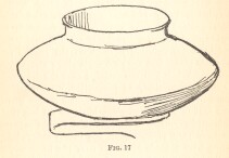
This is an important stage and settles for you [85] the key of tone that you will maintain throughout. Now paint the shadows and draw them in definite shapes (with a brush of moderate size, not by any means a small one), comparing their values either lighter or darker, or perhaps in places similar to the background. Ignore all marked passages of reflected light in the shadows, and let them merely be felt in the general tone where they come, but not outlined. Nothing gives a more commonplace or cut-up aspect than the marked reflections, on which the beginner insists. If you will only look at them, your eyes nearly closed, you will see how much less definite they really are than they look at first sight. All light passages enclosed between darker ones appear lighter than they are; remember this throughout your practice. Now paint your halftones, the tones coming midway between your middle tones and the shadows, in definite shapes and in definite planes, and then impose the lights more thickly so that the solidity of your cast becomes apparent; and see that the planes occupy their due areas in the map. Now draw and model the features, and when this is done, brush together lightly the edges of the shadow and half-tones, taking care not to lose the drawing, but rather to correct and supplement it in the process, " lose and find " the outline against the background, and maintain in completing the work a sense of the "oneness" which is [86] so essential-the nearest definition of "finish" I can think of. Let me now explain to you my reasons for recommending this particular method of painting. On a white ground you could not hope to realise your middle or general tone. Therefore it is well to lay in the background first, and then the general tone aspect of the subject, for the one reacts upon the other. Covering your drawing with a thin coat of the middle tone gives you a field of colour into which to paint. The actual painting stage really only begins when you paint into paint. Only in this way can your shadows and half-tones melt one into the other. Only in this way can you model round your planes, fusing one into the other-that is, when all is wet together, so that the brushing can assert itself and help the sense of undulation. Moreover, the laying in of the general tone aspect makes for simplicity and oneness, and enables yon with the fewest possible touches to realise the varying planes, and the solidity of your work. There will be little need to employ more than four or five tones, ranging from the shadows to the bright lights : all subtler shades can be modified in the final brushwork. Let breadth and simplicity be your watchwords. Although in the foregoing instructions I spoke about your completing the study, you are not likely to be able to finish it to your satisfaction so early in your practice, and in all probability [87] you will need and wish to take up the study again. Then how are we to proceed? To begin with, if towards the end of your first day's work you see that it is hopeless to finish your attempt, boldly take your large palette knife and sweep off all the paint that will yield to this process, evenly, from top to bottom of your canvas, working from right to left across it. You will find that with the exception of the surface paint so lifted a faint indication of all the varying tones and the general drawing will be left intact for your guidance on the morrow ; and what is equally important, the surface or grain of your canvas will be preserved. Moreover, by taking away the solid paint, the canvas, if placed near a stove or fire, will be dry enough to enable you to resume the work next day. It cannot be said that you are a capable painter until, with practice and all the necessary knowledge at your finger-ends, you are able to complete satisfactorily a passage of painting, such as this study and its background, at a single sitting, while the paint throughout is practically wet and malleable. By going over, and again erasing, the painting, as I have instructed you, a few times, say three or four, before you are quite wearied with the effort, you will at least have mastered some of the technical difficulties ; practised your hand ; and seen how the paint behaves, and what you can do with a brush as distinguished from your handiwork in charcoal or chalk. [88]
|
||||||||||||||||