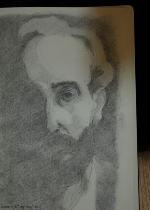
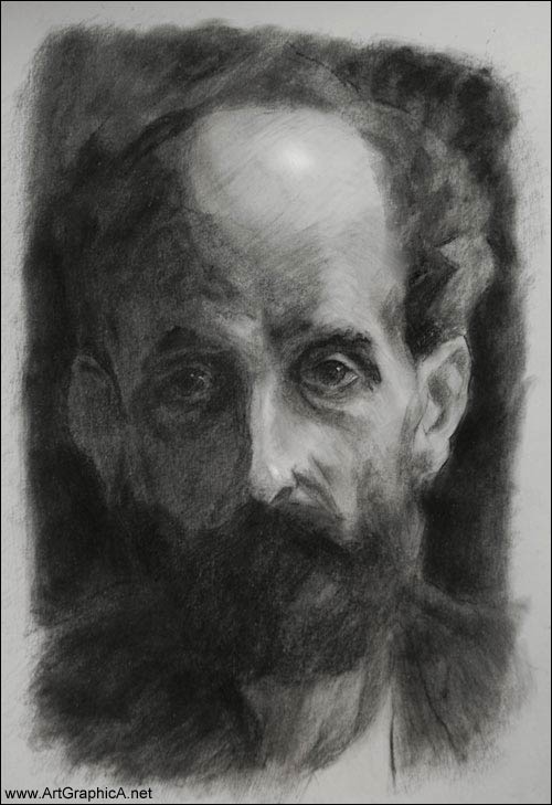
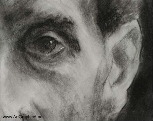
A portrait sketch made this morning in vine charcoal, after an oil painting by Anders Zorn. It’s essentially just two tones. A mid-tone was laid in, breaking light and shadow, and then a darker shadow tone. This was blended to some degree with a tissue, but it’s still quite rough and granular. To compensate for the subsequent overabundance of soft edges, and rapid toning, a 4B pencil was used to redefine some of the edges, especially around the eye and ear.
I tried a second sketch of the same subject on 8in by 10in cheap cartridge paper. It started off with water soluble pencils, but went horrible wrong when I came to flatten the graphite with water. I was going to abandon it, but went for the panpastels and started throwing in blacks with a sofft tool.
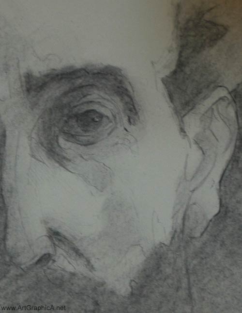
I used the sponge to model a little more of the midtones, and whilst areas like the cranium and ear could have done with a bit more work it was good to salvage something.
Vine charcoal was used to reinforce some of the drawing and edges, and I used a few flecks of white gouache to put highlights in the eyes, which I think would have been impossible any other way.
When asked which artists you admire, Luigi Loir isn’t a name that’s instantly recognisable, yet back in his day he was known as the painter of Paris. The sentimentality of Edouard Léon Cortès, Antoine Blanchard and Eugène Galien-Laloue are probably better known (and evidentally influenced by him), but with their garish colours and inferior handling of edges, for me they will never be in the same league as Luigi.
Luigi Loir was born in Austria in 1845, but to French parents, who were under the employment of the French royal family – the Bourbons. Many of his paintings are distinctly impressionist in nature, with a great handling of atmospheric conditions and typically seem to be set around dusk. One of the most exciting elements to his works personally, are the textures, and reflected lights of wet ground which make his urban scenes more full of life.
Last Christmas I purchased Noé Willer’s book on Luigi Loir (in both French and English), which is the only book I know of about the artist, which I can wholly recommend. I also purchased a small sketch from a Paris gallery which I have yet to frame.
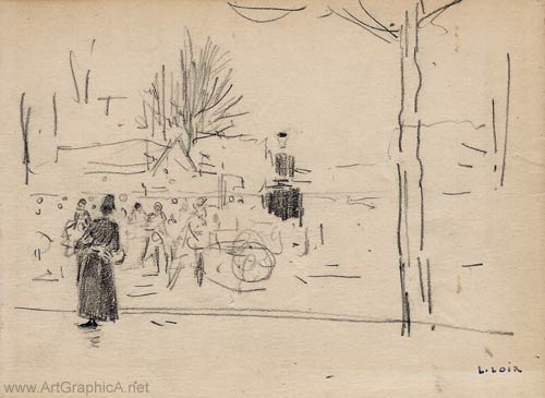
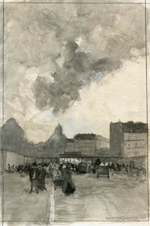
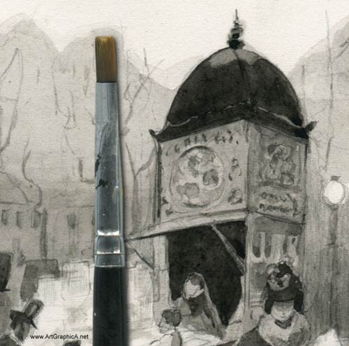
The following is a small watercolour sketch made this morning, based around a small oil sketch by Luigi Loir. You can view a blown up version of it here.
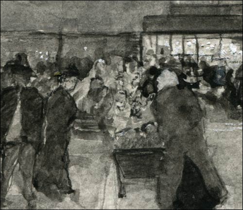
And some examples of Loir’s oil paintings, which are typically very small in size.
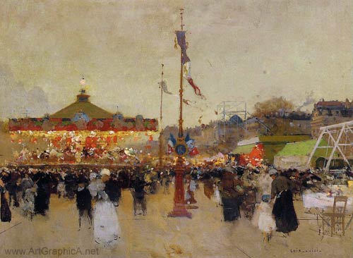
Les Preparatifs de la Fete Foraine. Luigi Loir.
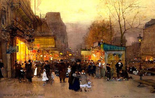
Porte St. Martin at Christmas. Loir.
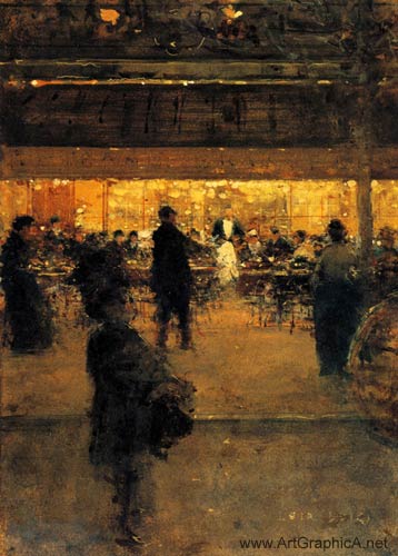
The Night Cafe. L. Loir
ArtGraphicA Facebook Page
Carlo Brancaccio (born 1861, died 1920) was an Italian impressionist, who left his pursuit of maths to start painting at the age of twenty-two. Brancaccio’s mentor was Eduardo Dalbono who was a professor of painting at the Naples Academy.
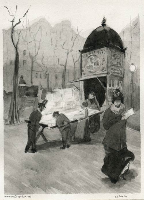
This is a quick 4inch by 6inch pencil/watercolour sketch (made on the flip side of yesterday’s sketch), based on Carlo’s Kiosk oil painting, created whilst spending time in the city of Paris.
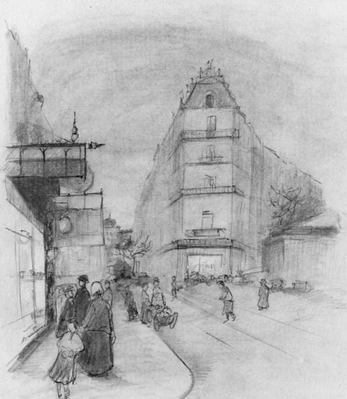
Childe Hassam was a renowned American impressionist whose early work in illustration paid enough for a Paris apartment near Place Pigalle, where he fully embraced Parisian life. At one point he even sub-let Renoir’s old studio. Whilst he studied at the Académie Julian, he was not swayed by the academic approach to art, and preferred the emotional appeal of his impressionist creations.
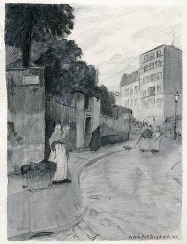
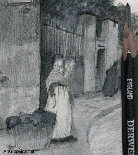
This is a small 10cm by 15cm sketch after Hassam’s Rue Montmartre, Paris. Following a rough pencil drawing, a few washes of watercolour were laid down, followed by some toning from a pencil and a few lines from a pen where the edges became too lost.
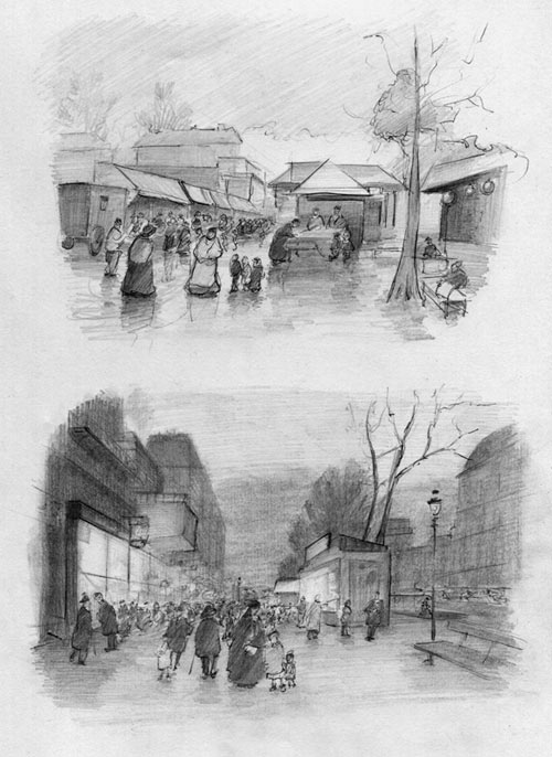
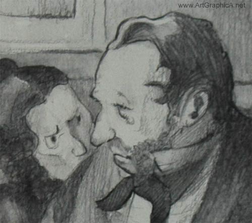
These are a couple of quick, small sketches of Paris – ballpoint pen on copy paper with basic toning using vine charcoal and a 2B pencil. They’re made after paintings by the former Parisian artist Luigi Loir.
The biro forces you to commit your lines, and you can vary the depth of tone to some degree. It’s good practice for freehand perspective, and I was aiming for a looser, more impressionistic sense to my sketching. I often end up going too tight, creating contours from outside lines, with little sense of gesture. I’m in the early throes of trying to loosen up and trying to see the composition as a whole rather than get lost in fickly details that often make sketches look noisy. It’s early days yet, but I’m looking forward to seeing where it leads.
Wilhelm Martin Busch was probably one of the most brilliant sketchers and draftsman I’ve come across, with a wonderful imagination and command of line, able to draw almost anything that came into his imagination. Before Busch passed away in 1987, he had illustrated some 300 books.
To properly appreciate Wilhelm Busch’s abilities and wonderful treatment of line and gesture, the Animation Treasures blog features hundreds of scans.
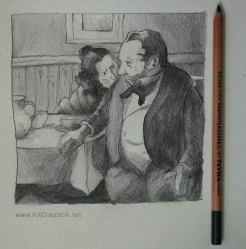
It’s humbling to attempt imitation of someone so masterful, but it’s only in practicing from great paintings and drawings that we improve. I made a quick sketch based on one of Busch’s own sketches (I believe the original might have been conducted in ballpoint pen), using watersoluble pencils. I recently acquired (actually they arrived today) some Rembrandt Aquarell pencils, that are available in HB, 4B and 8B, so why not kill two birds with one stone – massacre a Busch and use a new medium!
This was done in a moleskin watercolour book – it’s quite textured so not great for pencil drawing, but still usable. The sketch was roughed in with a 2B Derwent graphic pencil, as I wasn’t sure if it would wash away when I added water.
In the next stage I used the edge of the HB Rembrandt GraphiteAquarell and started to lay in some tones. It’s very textured due to the grain of the paper.
The darker tones were laid in with an 8B water soluble pencil.
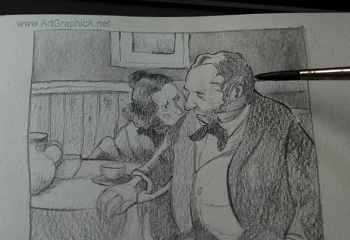
The moment of truth – how will the graphite respond! I’m guessing the graphite is mixed with gum arabic in order to make it susceptible to water washes?
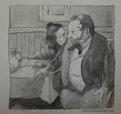
Well it seems to work quite well. It’s a like a cross between blending with a stump and using watercolour. There’s still enough texture from the paper to make it
interesting, but the brush fills in the weaves so that it’s not overly granulated. I found it best to run the brush over the graphite one or two times at most in order to keep the tones quite smooth.
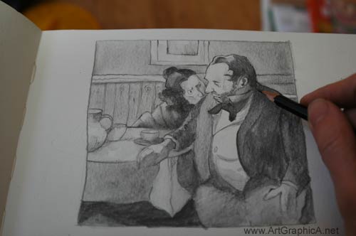
I returned to my 2B Derwent Graphic pencil which isn’t watersoluble, and added some lines to slightly improve the tones and bring back a little more texture. Overall it’s a nice way to sketch quickly and without having to labour over building up tones. The dark tones can be built up straight away with an 8B, and smoothed out with a watery brush – I would imagine only photorealists would be picky about its use.
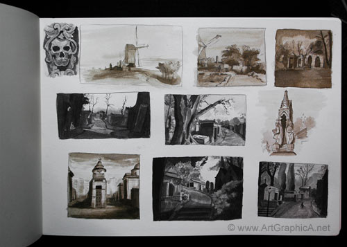
Self-taught artists have the arduous task of planning their own routes. Usually there isn’t a great deal of methodology, so stumbling around in circles and getting lost in inefficient pursuits is the usual norm, before discovering which paths lead to the most efficient means in which to gain forward momentum. If I could turn back the clock there are many things I would change in my approaches, not least of which is years of inactivity (partly born from frustrations and partly from the distracting demands of daily life). One thing that has been long overdue is the practicing of thumbnail sketching, and I shall attempt to explain why it’s one of the most invigorating means for developing your skills.
I do not know the reasoning behind the name. You couldn’t draw much in something the size of a thumbnail, especially without serious eye strain. ‘Thumb sketches’ would have been more apt, as they generally range between 1.5 inches to 4 inches. They can be as simple or detailed as you care to make them – even a few lines and strokes placed in under a minute can serve as a guide to better understand a scene. My ‘thumb sketches’ are more detailed than they need to be, predominantly as I used them as studies to improve drawing, freehand perspective, composition and basic values. With thumbnails you can kill several birds with one stone; their small size means you can create many small studies in the time it would take you to finish something larger, and hence cram in a lot more experience – great too for those on limited time. They’re also really cheap, for those on tight budgets.
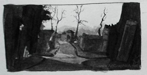
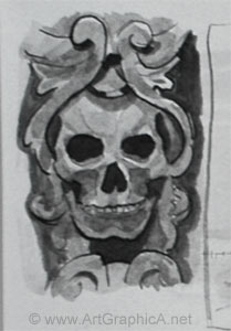
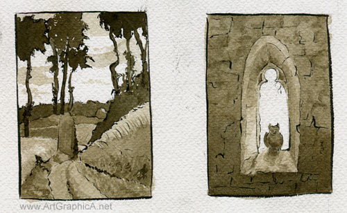
The thumbnail sketches in the first picture above are executed with a traditional pen nib and holder, and a cheap bottle of black shellac (waterproof) and sepia ink in a moleskine watercolour sketchbook). I have tried several nibs, most recently the hunt 100, which proved to be scratchy and impractical on a slightly textured watercolour paper (had I bothered to read the description, then I would have already known this!). My favourite nib is so encrusted with dried ink that I’m surprised how well it works. I believe it is a Gillott, but cannot make out anything more. Pen nibs are cheap, so you can always buy sample packs and experiment. When you receive the nib, you should give it a light scrub with an old toothbrush and washing up liquid to remove the coating, and encourage the flow of ink – neglecting this, the ink tends to stick inside the nib and defies gravity, leading some to give up before they even start. Some of the sketches have been done with sepia ink (two are rough copies after Rembrandt the rest are from photographs of Pere Lachaise cemetery in Paris).
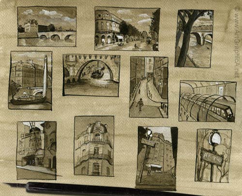
The Paris thumbnails are the smallest at just under 1.5in by 2.5in. I stained the watercolour paper (this is from a cheap German made pad) with diluted sepia ink first and used gouache for the highlights. The other sketches below are simple studies of famous paintings, from Francisco Goya and Winslow Homer to Anders Zorn and Caspar David Friedrich. For these, I used a Japanese Pentel brush pen for the first time. The ink flows nicely, and is a deep rich black. It creates a good variety of line, but I don’t favour it as much as a pen and nib. It is certainly a more practical pen for outdoor sketching though. I tried to contain the values to approximately three (you’re probably crying out, I can see more than three! It is true; there is a little more variety than that but mainly due to slight inconsistencies in the ink and going back over areas that didn’t work properly in the first ink wash).
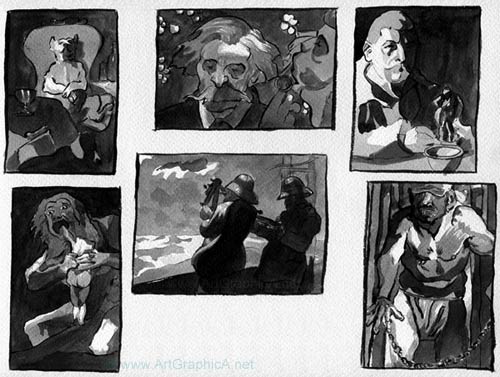
When looking at the originals, you need to squint and break down the values into light, dark and mid-tone. I painted the tones using a slightly oversized watercolour brush. Initially I dipped it straight into the ink bottle and laid down all the darkest tones in as few brush strokes as possible, afterwards diluting the ink with water to a mid-toned grey, leaving the white of the paper for the lights. The result is an instant impression and a basic breakdown of the overall composition. This provides a great means for studying, because these old masters have already done all the hard work for you, and in practicing you gain a better eye for how they composed their tones to create an impact.
Working from photographs is much harder in many respects. Photographs are an incredible resource, but unless you’re a photorealist, they are also the enemy, rendering far too many details, creating distortions, destroying values (not that this really matters for thumbnail sketching) and rarely providing ideal artistic compositions. You will need to pick and choose the elements you include, simplify shapes and foliage and if necessary deviate from the source in terms of improving light and shadow. Sometimes it works, sometimes it doesn’t, but this is why thumbnail sketching is so useful, as it provides the opportunity to practice and adapt. If something goes wrong you simply try again with minimal wasted time, and any sketches that jump out at you can form the impetus for a more developed painting or drawing.
I will try to create a future tutorial to properly explain my methods step by step. Whilst I used pen and ink (an unforgiving medium, but one that adds instant drama and impact), thumbnails are suited to almost any medium out there, from watercolour, to pencil and oils. I cannot recommend the practice highly enough.
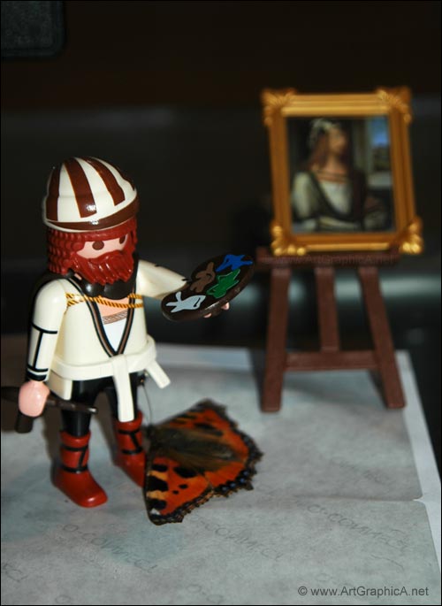
When a friend returned from a trip to Spain bearing a gift for my young son, bemusement and a smidgen of jealousy fell upon me. Little did I know that Playmobil produced none other than Albrecht Dürer, the famous Nuremberg painter.
Cruel parent that I am, I’ve temporarily taken him into protective custody and he’s sitting on my desk until my son learns how not to dismantle and lose things. I thought I would take a photograph to share, when a hibernating small tortoiseshell butterfly, from up in the timber roofing, decided that winter would be the opportune moment to spring to life. He must have been attracted to Dürer too, as after circling the studio once, he crash landed at the artist’s feet and remained there for some considerable time.
Undoubtedly trees can be tricky to draw. Their organic, seemingly haphazard forms demand attention and perhaps more crucial still is incorporating these organic masses into a well-balanced, compositional drawing. Even the best drawn trees will suffer if the overall design of the drawing is not well considered; sometimes that means playing with references (whether from life or photography, though observation from life is certainly preferential to gain an understanding of the three dimensionality of trees).
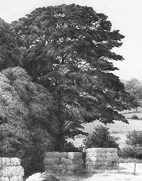
Whatever your style of drawing, to draw trees effectively you need to have a fundamental knowledge: how do trees grow, formation of trunk, branches, leaf formation, texture, size, structure etc. etc. We can identify trees because they are unique from one another, and therefore you should be able to draw a tree that could be identified as being from a particular species. If you really want to develop your knowledge, Rex Vicat Cole’s book THE ARTISTIC ANATOMY OF TREES provides a wealth of information for artists.
If you favour detail and realism, Mike Sibley’s demonstration HOW TO DRAW REALISTIC TREES aims to draw trees in great detail with an understanding of form and structure, crucial for shading and showing off the tree’s three-dimensionality.
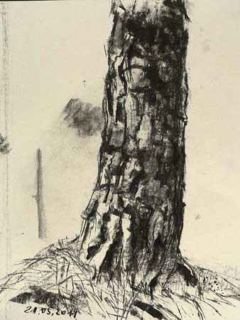 ArtGraphica has been a champion of charcoal in its use for drawing for many years. Its speed, tone, and malleability are hard to rival. Even the hardest up of artists (and as we all know artists are generally pretty skint!) can usually afford to purchase a few sticks, or failing that you can always go out into nature and make your own charcoal.
The various shapes and sizes of charcoal allow the artist to hold the sticks in various positions to create different textures, lines and tones. It is in this spirit that artist Martin Stankewitz goes outdoors, and demonstrates how to draw trees in a very simplified manner, using the edge of the charcoal to mass in larger areas of tone on grained paper. The texture of the paper is adapted to work as the bark and leaves of the tree, not only creating a lot more interest to the work, but also speeding up the process of capturing the spirit of the moment.
Illustrated with videos, this two part lesson is available free on the website. If you wish to learn how to draw and sketch trees in nature, using a product made directly from trees, then please check out the online tutorial: DRAWING TREES.